Overview
ProcessMaker Mobile features an Image control, which lets the user take a picture from the camera of a smartphone and save it to a Dynaform, or upload a picture from the current gallery of the smartphone.
Image Properties
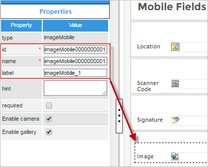
The properties of the Image control can be found under the Mobile Controls tab. To use it, simply drag and drop the control onto the form. Click on the Image control in the Dynaform to display the properties, which are shown in the image below.
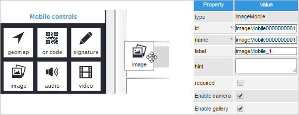
The first property is Type, which only shows the name of the field, in this case "imageMobile". The properties ID and Name are filled in by default. The ID of all the controls is automatically filled in with "ControlTypexxxxxxxxxx", where "xxxxxxxxxx" represents the correlative number of the control inside the designer. The Name property is also set by default. When the Name property is changed, the name of the field on the Dynaform will remain unchanged.
The next property is label, which allows the user to change the label of the control field on the Dynaform. In this case we changed it to "Image", but it can have a different name when running a real case.
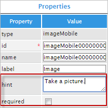
The Hint property allows the user to display information about the control field in the Dynaform. The description can be entered into the white textbox next to the Hint property in the left panel. The next property is Required, which is a checkbox that can be clicked if the end user needs to fill in the field before they can submit the Dynaform and continue with the process.
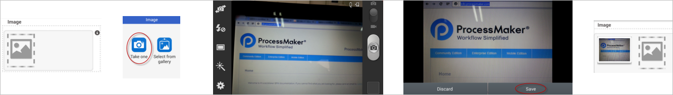
The last two properties are Enable Camera and Enable Gallery. Check the Enable Camera property to allow the end user to take a picture with their device's camera. If this option is unchecked, the end user will not be able to take a picture with their device's camera to enter into the Dynaform.
Check the Enable Gallery property to allow the end user to use the device's gallery to choose a picture. If unchecked, the mobile app won't allow the end user to choose images from the gallery.
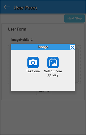
If both options are checked, the end user will have the option to choose between the camera or the gallery in the popup dialog.
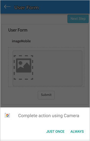
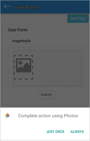
The application uses webkit tools exclusively for Android and iOS to display the form fields, thus forms are not rendered the same way as in the web edition (in the preview of the designer or when running cases). The screenshot below shows the Image control running on the mobile app.
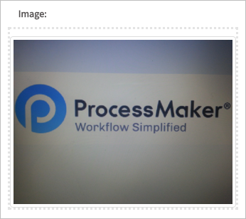
This is what the Image control looks like when opening a case in the web edition after saving the image in the mobile application.
Finally, the table below shows the property specifications mentioned before.
| Property | Description |
|---|---|
| Type | imageMobile (read only) |
| ID | [Required] Control unique identifier Cumulative dependence in PM Mobile controls is not consistent in PM Mobile: PM Mobile image, audio, and video controls that have the same control identifier controls do not properly pass their data from one Task to the next because these controls do not function cumulatively. As a best practice, do not use the same control identifier for image, audio, and video PM Mobile controls. |
| Name | Control name, set by default (but can be edited) |
| Label | The next property is Label, which allows the user to change the label of the control field on the Dynaform. |
| Hint | Used to show help when the field is rendered. It is shown when the pointer of the mouse is hovered over the ? icon. |
| Required | By checking this option, a red asterisk is added next to the label to indicate that the field is required. This property does not allow the end user to submit the Dynaform until an image is uploaded. |
| Enable camera | By checking this option, the mobile app allows end users to use the device's camera to take a picture. |
| Enable gallery | By checking this option, the mobile app allows end users to choose a picture from the device's gallery. |

