- Overview
- Type
- Variable
- Data Type
- ID
- Name
- Label
- Default Value
- Placeholder
- Hint
- Required
- Dependent Fields
- Text Transform To
- Validate
- Error Message
- Max. Length
- Mode
- Formula
- DB Connection
- SQL
- Options
- Format
- Min Date
- Max Date
- Use Current
- Default Date
- View Mode
- Show Clear
- Text
- Function
- Href
- Value
- Layout
- Page Size
- Src
- Alternate Text
- Comment
- Alt
- Shape
- File Extensions
- Size
- Size Unit
- Description
- Col-Span
- JavaScript
- Language
- External Libs
- Content
- Border
- Add Row
- Delete Row
Overview
Each control available in the designer has properties that give designers the ability to customize the DynaForm layout besides having more control over the behavior, functionality and the use of resources. By customizing the properties of a control, designers can easily create dynamic forms without the necessity of adding extra code. These properties vary according to the control covering the needs for the performance of each one of them.
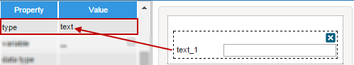
Type
| Available in Controls: All controls |
This property simply describes what type the control is. It is set when the control is added to the design.
Variable
| Available in Controls: Text, TextArea, Dropdown, Checkbox (group), Radio (group), Datetime, Suggest, Hidden, Grid |
This property belongs to all controls that can be related to a variable. It simply shows the name of the variable related to the control.
To relate a variable of the project with a control added in the DynaForm, go to the "Variable" property of the control.
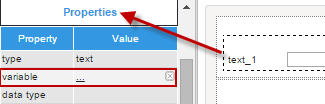
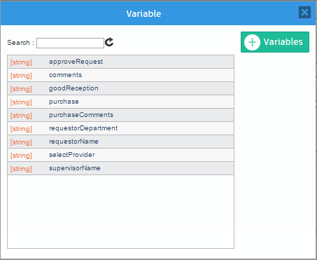
Click on the ... icon and a window with the available variables for the control will be listed.
Select the variable from the list and the window will close. The variable, data type, and the id of the control will be related to the selected variable.

To unrelate the variable to the control click on the 'X' option at the right side of the name of the variable. To change the variable related to the control click on the name of the variable and the window with the list of variables will display again.
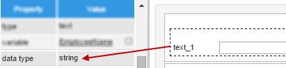
Data Type
| Available in Controls: Text, TextArea, Dropdown, Checkbox (group), Radio (group), Datetime, Suggest, Hidden |
This property displays the data type of the variable that has been related to the control. It is worth mentioning that variables will only be available depending on the type of control. For example, for the Datetime control then a string variable will not be available. If no variable is related to the control, then the value of this property will be empty.
ID
| Available in Controls: All controls |
It is required that all controls have a unique identifier. That identifier is set in this property. By default, the ID of all the controls has the ControlTypexxxxxxxxxx format where xxxxxxxxxx represent the correlative number of the control inside the designer. For example when adding the first text control to the designer the ID set will be Text0000000001
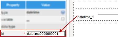
When a variable has been related to the control, the ID will be set the same as the name of the variable
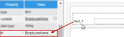
However, in both cases this ID can be edited by entering the new ID in the text field of the property. Take into account that two controls can not have the same ID inside the design.
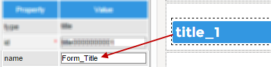
Name
| Available in Controls: Title, Subtitle, Annotation, Link, Image, File, Submit, Button |
It is possible to add a name to some controls managed inside the designer. By default, the control with this property has the same name as the ID set by default. When the ID is changes by the user, the name does not change and keeps its original configuration. The name can also be changed by entering a new value in the property.
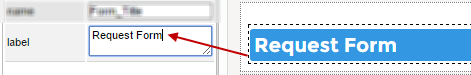
Label
| Available in Controls: Text, TextArea, Dropdown, Checkbox (group), Radio (group), Datetime, Suggest, Title, Subtitle, Link, Image, File, Submit, Button, Grid |
This property sets the text which will be displayed as a reference next to the control in the design of the DynaForm. The Label should clearly identify the purpose of the field so users know what to input in the field. Whether or not the control is related to a variable, then the label is set in the format ControlType_x, where x represents the correlative number on the control in the design.
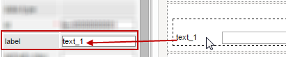
Note: Changing the "Label" in a DynaForm will not change the "Label" of the variable.
For the title, subtitle, button and submit controls, this property is used to customize the labels with which they will be shown. For example, for the title replace the label that goes by default:
Default Value
| Available in Controls: Text, TextArea, Dropdown, Checkbox (group), Radio (group), Suggest, Hidden, Link |
The default value of the field is the value which will be automatically inserted in the field when the DynaForm is first displayed. Enter the default value in the properties of the control.
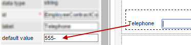
The user may alter this value when filling out the form.
Placeholder
| Available in Controls: Text, TextArea, Datetime, Suggest |
This property is a text set by the designer as a reference of what should be input inside the field. This text is shown in a lighter color inside the field and does not act as a input text if the form is submitted and its value is not completed. It just acts as a hint.
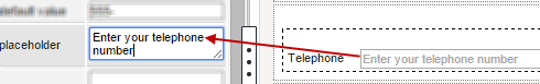
When rendering the form, the placeholder set is shown as>
Users who enter data in the field do not need to erase the text shown inside it. By simply clicking inside the field and start typing text the text set as plaholder dissapears.
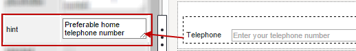
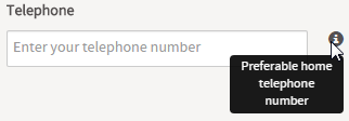
Hint
| Available in Controls: Text, TextArea, Dropdown, Checkbox (group), Radio (group), Datetime, Suggest Image File Grid |
This property displays helpful hints to guide users when entering values in the fields of the controls. A hint can be used to provide a fuller explanation of the field or to indicate what values are acceptable for the field. When a field has this property enabled, an ? icon appears to the right of the field only when the form is rendered. The hint message pops up only when a mouse pointer hovers over the icon.
Define its value by clicking on its text area:
The icon of this property will be only visible in the preview mode or while running a case:
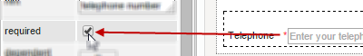
Required
|
Available in Controls: Text, TextArea, Dropdown, Checkbox (group), Radio (group), Datetime, Suggest, File |
Check this property to make users fill in the field, so it is not left blank.
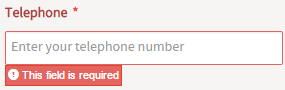
A red asterisk * will be displayed at the right side of the label to indicate that it is required.
When running a case or viewing the preview of a DynaForm, all required fields will be checked to ensure they are not empty. In case a required field has been
submitted without filling it, a message is shown and the form is not submitted.
Dependent Fields
|
Available in Controls: Dropdown, Suggest |
This property allows other fields to be selected as dependent fields and thus convert the current field as an independent field.
In order to establish this dependence-independence, the variables should normally be defined with a SQL SELECT statement to populate the
fields with values from a database, which will be shown once the DynaForm is rendering in the preview or running the form.
Take into account that for the dependency and correct retrieve of the data the query must be case sensitive.
It means that if the name of the table or the name of the fields contain uppercase or lowercase letters in the database,
the query mandatorily must have the same considerations.
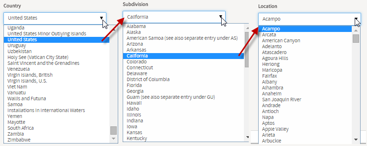
For example, for the country-state-location dependency:
Let's create three variables for the dependencies.
First the listCountry variable and within its settings add the following SQL query:
Now, for the listSubdivision variable, the SQL query:
WHERE IC_UID = @@PAISES ORDER BY IS_NAME
And for the listLocation variable:
WHERE IC_UID = @@PAISES AND IS_UID = @@DEPARTAMENTOS
Then, add three dropdown controls in the designer and associate each one of them with the listCountry,
listSubdivision and listLocation variables, respectively. Set the dependency of the fields by clicking on the "edit..." button of the
Dependent Fields property.
For the "Country" dropdown, its dependent fields must be the "Subdivision" and "Location" dropdowns. Take into account the relation of the fields
in the database to set the dependency. If the dependency consists of more than two fields, the main field must hold the dependency of all the rest of the dropdowns.

For the "Subdivision" dropdown, its dependent field would be:

Notice that for the dropdown only the "Location" dropdown was available for selection. When a control is dependent of another
the dependency can not be made viceversa.
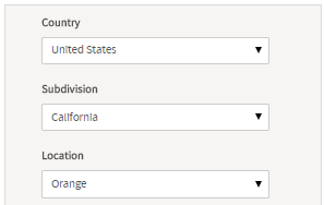
When rendering the form, to obtain the following result:.
Let's check the dependency:
If having problems setting the dependent fields, take into account the following
- The name of the variables may have not respected the name of the fields or the table set in the database
- The dependency of the controls may have not been set correctly.
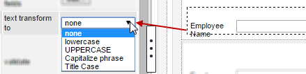
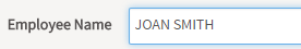
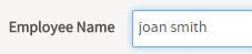
Text Transform To
|
Available in Controls: Text |
This option transforms any entered text automatically to UPPER CASE, lower case, Capitalize phrase
(the first letter is changed to uppercase ), or Title Case (the first letter in every word is changed to uppercase).
Select the type of transformation inside the properties of the control.
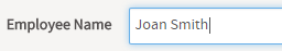
Changes will be shown when the form is rendered inside the preview or when running a case. For example:
Original text.
Transformed to UPPER case.
Transformed to lower case.
Validate
|
Available in Controls: Text, TextArea |
This property provides options to limit the input of certain types of characters to guarantee that the user will enter valid data into the field.
This validation can be made over the input of integer and float numbers, strings such as email addresses and others by using regular
expressions to create search patterns in the input. This property has a help section to easily help users insert a regular expression and
later customize it according the necessity of the case.
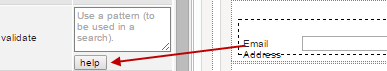
A window opens with the examples of regular expressions that can be used in this property. To use any of them simply clck on the option.

The regular expression selected will be inserted in the value of the property where the corresponding editions can be made to customize the validation.
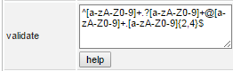
As in the image above, the regular expression used to validate an email address provided by the help option of this property is the following:
This regular expression verifies that the first section of email address contains letters in upper or lower cases and/or numbers from 0 to 9 in the expression
[a-zA-Z0-9]. Then, the expression verifies that the email address is followed one special character optionally, and again letters and/or numbers after it in the expression
.?[a-zA-Z0-9]. As this validation is made for an email addres, the validation also verifies that the address contains the "@" character
followed again by characters that contain letters and/or numbers, a dot and after it more letters and/or numbers.
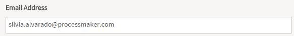
If using the validation shown before, when rendering the form the validation will be like the following when entering a valid email address>
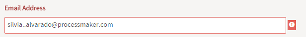
For a not-valid email address, the warning is shown when the event OnChange() is triggered.
Take into account that the validations are made using the RegEx of JavaScript and
is not mandatory to use the help option to insert validations, they can be entered manually.
To learn more about how to construct these expressions visit this page for a complete reference
Error Message
|
Available in Controls: Text, TextArea |
This property is related to the Validate property and simply
sets the message error shown in case the evaluation for the field is False.
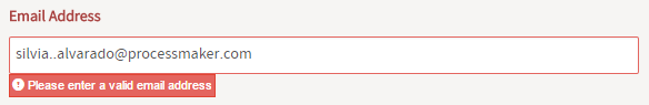
For the example of the email address validation, let's set the error message:

When rendering the form and entering a not-valid email address, the message displays:
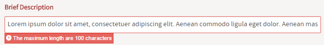
Max. Length
|
Available in Controls: Text |
This property defines the maximum number of characters which can be input into a text control field. This property is also a validation
made over these fields, but if a regular expression has been set inside the "Validate" property, this validation will be verified first before the Max. Length.
Theoretically the property definition allows a maximum of 9,999,999,999 characters to be entered into the field, but the web browser probably will not have
enough memory to handle that amount of input. Furthermore, ProcessMaker can only store up to 16MB of data about a case, which would be 16,777,216
characters (assuming there are no international characters which need more than 8-bits). On a practical note, it better to use textareas and
file objects to store large amounts of data, since they are stored separately in the database and will not slow down the processing of ProcessMaker,
nor are they subject to the same space limitations as textboxes.
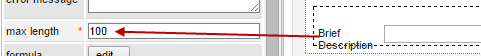
For example, if the max length is set to 100, if overpassing the size, the following message will be shown:
Mode
|
Available in Controls: Text, TextArea, Dropdown, Checkbox (group), Radio (group), Datetime, Suggest, Image, File, Grid |
This property determines whether the user will be able to edit the input of a field or only view it.
The modes available in the designer are the following:
- Parent. This mode inherits the mode set in the main form
of the DynaForm. That's the reason why, inside the "mode" property of the Form, the "Form view" mode is not available since
the hierarchy of elements in a DynaForm starts with the Form. For example, if inside the properties of the form, the "Disabled"
option has been set, and inside the control the mode is been set as "Form View", when running a case, the control will be disabled
as the property of the form will be inherited.
- Edit. This mode is set by default every time a control is added and allows users inputting text inside the controls of the DynaForm.
- View. This mode changes the style of the control showing only the label changing the input box of the control to a label without text.
- Disabled. This mode disables the input of text inside the fields of the controls with input boxes.
For dropdown, radio, and checkbox (group) controls it also disables the selection of the elements.
For the suggest control it disables the input of text and shows inside the field of the control, the message "Untitled".
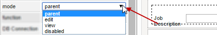
The mode property also affects the appearance of the field, so the user can see whether a field is in edit, view or disabled mode. Controls in "view" mode only display their label, but do not display an outline of the field. Likewise, dropdown controls only display their label, but do not allow the user to see the outline of the dropdown box, nor see any of the other available options. Radio (group), checkboxes and suggest display all their available options, but their borders a slightly greyer to indicate that they are in view mode. Controls that have been "disabled" have the same appearance as controls in the view mode, but when the cursor is hover over them, the shape of it changes to a prohibited sign.
When viewing the design of the DynaForm in the preview or when running a case:
Edit Mode
View Mode
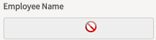
Disabled Mode
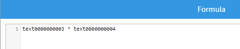
Formula
|
Available in Controls: Text |
This property allows the use of mathematical formulas based on the values in text fields in a form.
Click on the "Edit" button in the formula property of the text control:
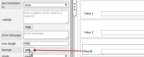
A modal window opens where the content of the formula must be added. In the example, the field "Result" will show the result of the multiplication between
"Value 1" and "Value 2". Nevertheless, take into account that the formula must be made using the ID of those text controls, then
the formula to be entered would be:
When running a case, the fields that have a formula are disabled to input text. The results of the mathematical operations are shown as the values are entered in the fields included in the formula.
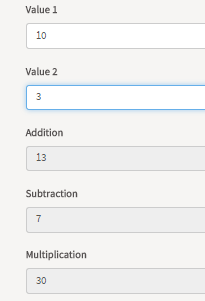
The formulas can consist of the IDs of text fields, numbers and the following mathematical operators:
| Operator | Description | Example |
|---|---|---|
+ |
Addition | salesPrice + tax |
- |
Subtraction | salesPrice - discount |
* |
Multiplication | salesPrice * quantity |
* |
Division | pounds / 2.2046226 |
(...) |
Grouping | (currentSales - previousSales) / previousSales |
Multiplication and division have higher precedence than addition and subtraction. In the following formula:
First, the discount is multiplied by the taxRate, then the result is subtracted from price. Parentheses can be used to change the order of the mathematical operations:
Now, the discount is subtracted from the price, then the result is multiplied by the taxRate.
The results of the calculation are displayed in the field containing the formula the moment that the user changes the value of one of the fields used in the formula. If the user enters a value in a field which can't be interpreted as a number, then the field containing the formula will blank (i.e., set to an empty string). To force the user to only enter valid numbers in fields, it is recommended to either use a mask or set the validate property to only accept numbers:
- Only integers:
^\d+$ - Only positive or negative integers:
^[\-+]?\d+$ - Integers or decimal numbers:
^[\-+]?\d*\.?\d*$ - Number with up to two decimal digits:
^[\-+]?\d*(\.\d{0,2})?$ - Number with exactly two decimal digits:
^[\-+]?\d*\.\d{2}$
Formulas can also be used in text fields found in grids. Formulas in grids can only contain the IDs of other fields in the same row in the grid, so it is not possible to reference fields outside the grid or fields in other rows in the grid. If needing to do calculations based on fields outside the grid, it is recommended to add JavaScript code that uses form.setOnchange() to set an event handler which calculates the formula when a value in the grid changes.
DB Connection
|
Available in Controls: Text, TextArea, Dropdown, Checkbox (group), Radio (group), Suggest, Hidden |
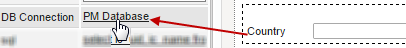
This property shows the name of the connection to the ProcessMaker database ("PM Database")
or to an existing connection inside the process to an external database. If the connection has been previously set
inside the variable related to the control, then, it will be already included in the properties of the control,
but it will be possible to change it by clicking on the name of the database set by default.
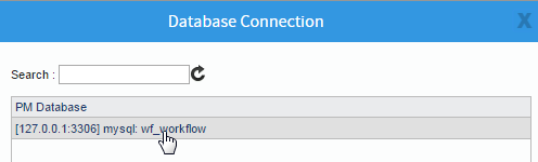
A modal window opens with the list of existing Database connections inside the project.
To change the default connection, simply select one of the connections from the list
When the connection changes in this property and the control has been related to a variable, the configuration of the variable does not change outside
the form. This property is a customization that will only apply to the current design.
It also implies that if the configuration of the variable changes later, that change will not be reflected inside the form.
This property is directly related to the SQL property in which the query to retrieve the data is set.
See the example of this property to view the complete functionality of these properties.
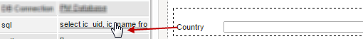
SQL
|
Available in Controls: Text, TextArea, Dropdown, Checkbox (group), Radio (group), Suggest, Hidden |
This property shows the SQL query, which will populate the control, set in the variable when it was created.
However, this property also allows to set the query for the control so data is retrieved from a database. By default, the connection of ProcessMaker to its database in MySQL is called "workflow".
For example, let's show the complete list of countries inside a dropdown control.
The table "iso_country" from the ProcessMaker default database "wf_workflow" has this list stored.
View the properties of the control. As mentioned before, ProcessMaker's default connection to its database is "wf_workflow" which is set in the property
"PM Database". Then, the query inside the "SQL" property id the following:
SELECT IC_UID, IC_NAME FROM iso_country
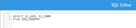
When running a case or viewing the control inside the preview, the control will be populated with the list of all countries.
Take into account that when there are changes in this property and the control has been related to a variable, the configuration of the variable does not
change outside
the form. This property is a customization that will only apply to the current design.
It also implies that if the configuration of the variable changes later, that change will not be reflected inside the form.
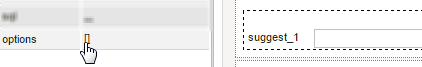
Options
|
Available in Controls: Text, TextArea, Dropdown, Checkbox (group), Radio (group), Suggest, Hidden |
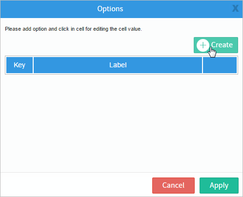
This property shows, edits and/or adds options set of the control that may be related to a variable or not.
A window opens which contains the options set in the variable (if they exist), or, as in the figure below, the options to add
options to the control by clicking on "Create".
A row with the fields enabled to add the options appears below. After setting the "Key" and the "Label" simply press "Enter" to add the option.
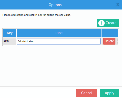
Click on "Apply" to save and set the options in the control.
When the options of the control change in this property and the control has been related to a variable, the configuration of the variable does not change outside
the form. This property is a customization that will only apply to the current design.
It also implies that if the configuration of the variable changes later, that change will not be reflected inside the form.
Format
|
Available in Controls: Datetime |
This property is only available inside the DateTime control. And it allows formatting the date and time selected as input. As the designer uses bootstrap, this is a more robust option. Take into account the following name and conventions to set the format.
-
Token Example Month M 1 2 ... 11 12 Mo 1st 2nd ... 11th 12th MM 01 02 ... 11 12 MMM Jan Feb ... Nov Dec MMMM January February ... November December Quarter Q 1 2 3 4 Day of Month D 1 2 ... 30 31 Do 1st 2nd ... 30th 31st DD 01 02 ... 30 31 Day of Year DDD 1 2 ... 364 365 DDDo 1st 2nd ... 364th 365th DDDD 001 002 ... 364 365 Day of Week d 0 1 ... 5 6 do 0th 1st ... 5th 6th dd Su Mo ... Fr Sa ddd Sun Mon ... Fri Sat dddd Sunday Monday ... Friday Saturday Day of Week (Locale) e 0 1 ... 5 6 Day of Week (ISO) E 1 2 ... 6 7 Week of Year w 1 2 ... 52 53 wo 1st 2nd ... 52nd 53rd ww 01 02 ... 52 53 Week of Year (ISO) W 1 2 ... 52 53 Wo 1st 2nd ... 52nd 53rd WW 01 02 ... 52 53 Year YY 70 71 ... 29 30 YYYY 1970 1971 ... 2029 2030 Week Year gg 70 71 ... 29 30 gggg 1970 1971 ... 2029 2030 Week Year (ISO) GG 70 71 ... 29 30 GGGG 1970 1971 ... 2029 2030 AM/PM A AM PM a am pm Hour H 0 1 ... 22 23 HH 00 01 ... 22 23 h 1 2 ... 11 12 hh 01 02 ... 11 12 Minute m 0 1 ... 58 59 mm 00 01 ... 58 59 Second s 0 1 ... 58 59 ss 00 01 ... 58 59 Fractional Second S 0 1 ... 8 9 SS 0 1 ... 98 99 SSS 0 1 ... 998 999 Unix Timestamp X 1360013296 Unix Millisecond Timestamp x 1360013296123
- Note: Name and format taken from [1]
For example, if the following format is set in the property:
When picking a date from the date picker, the following will be the input for the field.
Note: By default, this property is set as "false". When it is left in that state, the input in the control will be "MM D YYYY h:mm a".
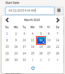
Min Date
|
Available in Controls: Datetime |
This property prevents users from making date/time selections before this date.
By default, this property is set as "false", so no restriction is made to the dates.
The values of this property could be "date", "moment", or "string".
For example, when setting the minimum date to 03/12/2015:
As shown in the image, the dates before "03/12/2015" are not enabled and it is not possible to jump to February.
If attempting to so that, the mouse cursor shows a prohibited sign.
Max Date
|
Available in Controls: Datetime |
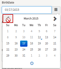
This property prevents users from making date/time selections after this date. By default, this property is set as "false",
so no restriction is made to the dates. The values of this property could be "date", "moment", or "string".
For example, when setting the maximum date to 03/17/2015:

As shown in the image, the dates after "03/17/2015" are not enabled and it is not possible to the next months. If attempting to so that, the mouse cursor shows a prohibited sign.
Use Current
|
Available in Controls: Datetime |
When this property is set as "true", it set the date picker with the current date and time.
Default Date
|
Available in Controls: Datetime |
This property sets the default date and time when using the date picker.
This property is set by default as "False" and it's related to the "Use Current" property. When the "Default Date" is set, it overrides the "Use Current" property and sets the time picker with the date and time set inside it.
View Mode
|
Available in Controls: Datetime |
This property sets the default view to display when the picker is shown. The possible values of this control are described below.
- "Days" Shows the date picker by days.
- "Months" Shows the date picker by months.
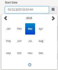
- "Years" Shows the date picker by years.
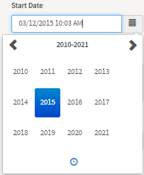
This property is set by default with "Days".
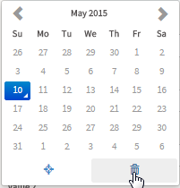
Show Clear
|
Available in Controls: Datetime |
This property shows the "Clear" button in the icon toolbar. When this button is clicked it will set the calendar to null.
Text
|
Available in Controls: Text |
The text set in this textarea field will be the content of the comment.
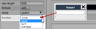
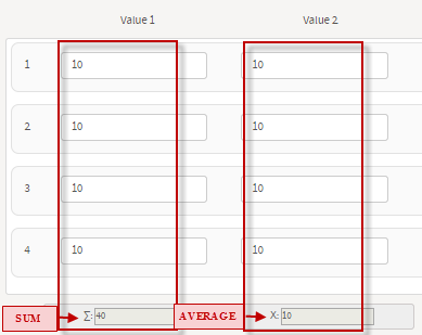
Function
|
Available in Controls: Text |
This property belongs to the Text control and is used exclusively
inside grids. It offers predefined mathematical functions to sum columns
or to obtain their average.
This property only works with text controls which are integer or float in the data type of the variable. A text control with this characteristic must be added as a column in the grid and inside its properties the function must be selected:
When running a case or reviewing it inside the Preview, users will see the results automatically as the quantities are entered.
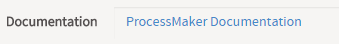
Href
|
Available in Controls: Link |
This property sets the URL address to external pages.
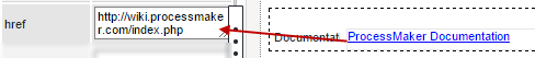
When rendering the DynaForm in the preview or running a case, the text in blue color will be the link to the URL specified in this property. Users must click on them to open the web page.
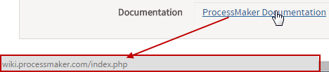
Value
|
Available in Controls: Text |
This sets the text of the link to a external page.
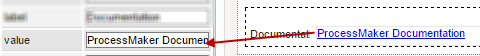
When rendering the DynaForm in the preview or running a case, the text in blue color will be the value set in this property.
Layout
|
Available in Controls: Grid |
This property sets the way grids will accommodate their rows since the moment they are rendered in the preview of the DynaForm or when running a case.
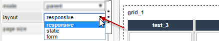
The options of this property are:
- Responsive
- Static
- Form
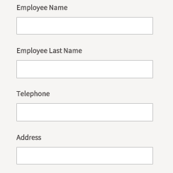
When the layout of the grid is set as responsive, the columns accommodate immediately according to the size of the screen making them wider or shrinking them. If there are many columns defined in the Grid do not use the Responsive layout, instead use the Form layout. For the static layout, the grid maintains its size despite the size of the screen. In this type of layout, if the length of the grid surpasses the length of the screen, a scroll bar enables so users can still work with the grid. For the form type of layout, when the length of the grid surpasses the length of the screen, the columns of the rows accommodate one after another as form fields. Check the figures below to view the differences among them.
Responsive Layout
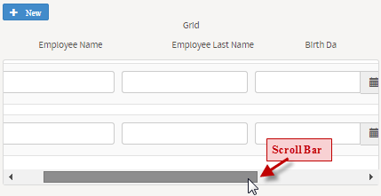
Static Layout
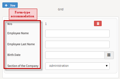
Form Layout
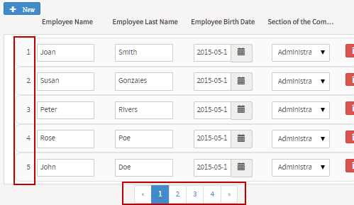
Page Size
|
Available in Controls: Grid |
This property sets the page size of the grid. Gets or sets the number of items to display on a single page of the grid.
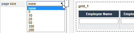
When rendering the form and adding more row in the grid than the size defined in this property, a new page is added and
the navigation control appears at the bottom of the grid.
By default, this property is set as "None", thus the rows of the grid are added one after another
Src
|
Available in Controls: Image |
This property and sets the URL address where the image is located.
For example, if the image to be shown in this control is the ProcessMaker logo located at the URL address:
The Src property must be set with this URL address.
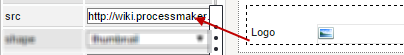
The image won't be shown inside the designer, but when rendering the DynaForm in the preview or running a case:

Alternate Text
|
Available in Controls: Image |
This property sets the alternate text displayed in the Image control when the image is unavailable.
Browsers that support the ToolTips feature display this text as a ToolTip.
Setting the property inside the desginer.
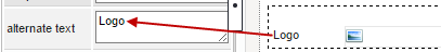
Images that can not be found in the address specified in the SRC property, or other reason why the image can not be rendered
will dispay the alternate text set for the control
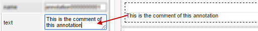
Comment
|
Available in Controls: Image |
This property adds a comment under the rendered image in the preview of the DynaForm or when running a case.
First, set the comment in the properties of the image:

This comment will be visible when running a case:
Alt
|
Available in Controls: Image |
This property sets the alternate text of an image. This text will be shown in cases when the image for some reason cannot be displayed (because of slow connection, lack of the src property, etc.).
Set this text in the properties of the image:
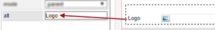
For example, if the src property was not set and when rendering the DynaForm:
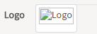
Shape
|
Available in Controls: Image |
This property is used to create the following predefined shapes on rendered images: thumbnail, rounded or circle.
Select the shape with which the image will be shown from the dropdown menu of the control property:
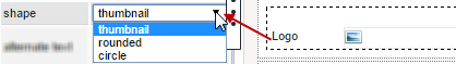
The thumbnail shape renders images as thumbnails which will show a reduced size version of the image.
The rounded shape rounds and softens the borders of the image.
Finally, the circleshape shows the rendered image circling the border of the image. See the examples below:
Thumbnail Shape.

Rounded Shape.

Circle Shape.
File Extensions
|
Available in Controls: Image |
This property defines the extensions of the files that could be uploaded inside the control.
For this, define the extension in the "File extensions" property:

For example, if only .pdf files are defined in this property and when running a case, users intend to attach a
file with an extension different from .pdf, a message box opens:

By default, this property is set with an asterisk (*) which means that users can upload all types of files with any extension.
To define more than one type of extension, simply add commas between the definition: .pdf, .txt
Size
|
Available in Controls: Image |
This property defines the maximum size of the files to be uploaded. This property is related to the "Size Unit" property
explained later in which the unity (KB, MB) of the size defined in this property is set:

When running a case, the control will validate the size of the file before attaching it to the field.
If the size of the file surpasses the size defined in this control, a message like the following is shown:

It is also possible to define the size using decimal numbers (separated by dots) to have a major precision with the files uploaded.
Size Unit
|
Available in Controls: Image |
This property defines the unity (KB, MB) of the size defined in the "Size" property explained previously.

When running a case, the control will validate the size of the file before attaching it to the field.
If the size of the file surpasses the size defined in this control, a message like the following is shown:
It is also possible to define the size using decimal numbers (separated by dots) to have a major precision with the files uploaded.
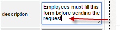
Description
|
Available in Controls: Form |
This property allows designers add a brief description of what the DynaForm is about.
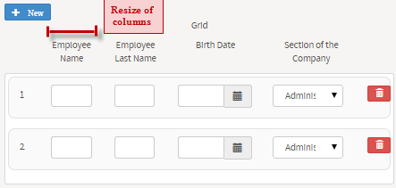
Col-Span
|
Available in Controls: Row |
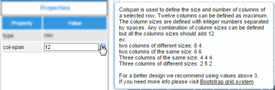
Each row of a DynaForm is placed inside an HTML table which adds rows as controls are inserted in the design. Though these rows by default carry only one control at the time, they have the "col-span" property that allows adding up to 12 columns where controls can be inserted. This also means that, by default, when a row is added the col-pan is set to 12, which means the control will span the 12 columns available of the row.
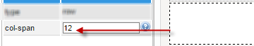
The span set in this property must be inserted manually per each column added. Remember that the maximum number to be set in this property is 12 which means there will be only one column in the row which occupies 100% of it. To add columns to the row, set the span they will take in the row. For example, if the row will have two columns, set the span the column at the left will occupy:
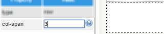
The field auto completes the span at the right. In the example, since the number set for the column at the left is 3, the field auto completes the span at the right with 9.

If the columns should occupy the same number of span, then the number set by the user should be 6.
To add more than two columns to the row, set the number of span for each of these columns in the same field, separated by blank spaces. For example, if the row will have four columns that occupy the same span, the user must enter the first three values of the span of the columns that will be added at the left:
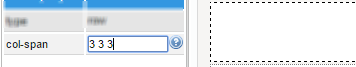
The field will automatically set the number for the last column at the right, 3:

Then, add controls to each one of these columns as normal:
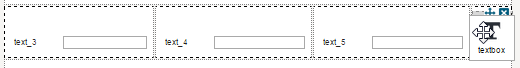
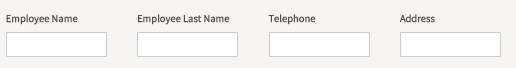
When displaying the DynaForm in the preview or running a case, the columns will be shown like:
As the DynaForms created in version 3 of ProcessMaker are responsive, for example, the columns of the DynaForm in a smartphone will look like:
Finally, the maximum number of columns to be set up are 12, so to have the 12 columns in the row set the first eleven values of the columns as "1 1 1 1 1 1 1 1 1 1 1" and the field will auto complete the last span as 1 as well.
This property also has added a help section by hovering the mouse over the ? icon
JavaScript
|
Available in Controls: Form |
This property JavaScript code to enhance and give more functionality to the behavior of the form.
To add JavaScript commands to the form, click on the "edit..." button of the property.

A editor window opens where the JavaScript code must be added.
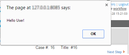
For example, let's add a simple alert when the form is loaded:
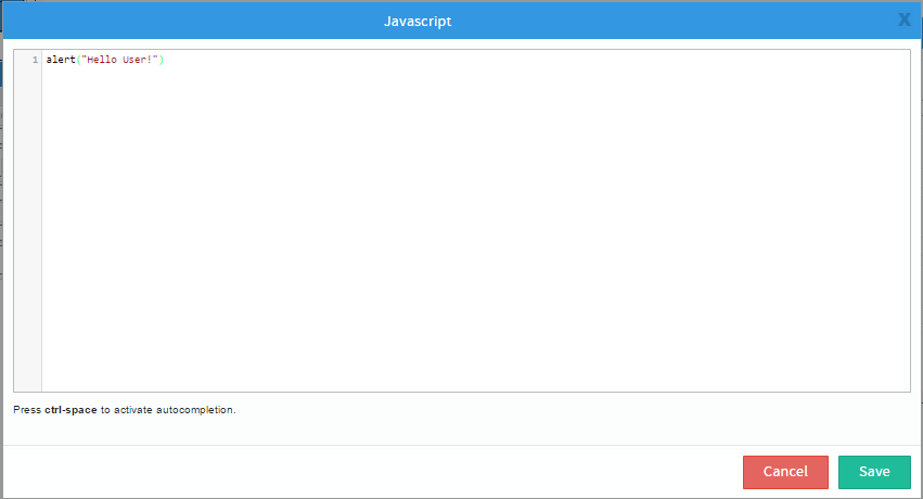
Save the code inserted by clicking on "Save" at the lower part of the editor. When the DynaForm opens, running a case, the message is shown:
To view more examples using JavaScript in DynaForms, the scope of the property and
a better explanation of the use of the code, take a look at the documentation for>
Language
|
Available in Controls: Form, |
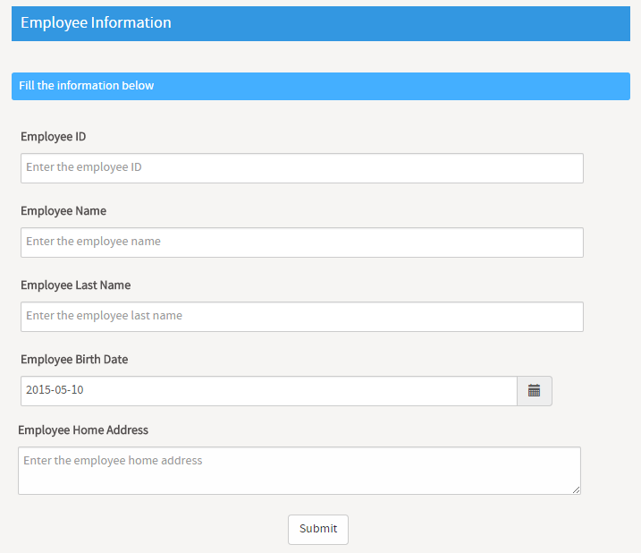
This property allows selecting the language with which the form will be rendered when running a case. All DynaForms are created with the "English" language, by default. Nevertheless, if more languages have been uploaded for the DynaForm, the dropdown menu of the DynaForm will list all of them.
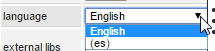
For example, a DynaForm created with the "English" language.
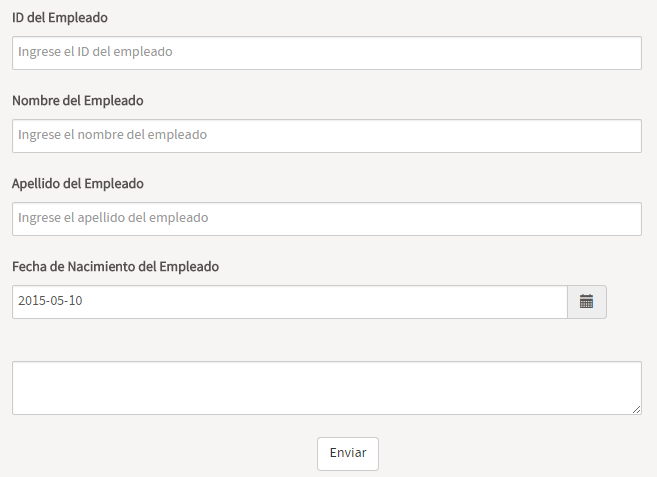
Let's change the language by selecting "es"
When rendering the form, the following is shown>
To learn how to work with the translations files of DynaForms check the documentation of this page.
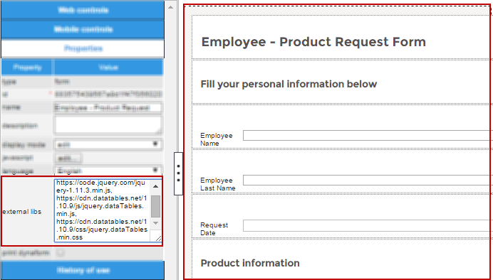
External Libs
|
Available in Controls: Form |
This property allows adding external libraries to the DynaForm in order to add extra functionality, behavior, content or other elements inside the DynaForm. This property is related to the Panel control property "Content" where HTML/HTML5 code can be inserted to be rendered in the DynaForm.
Libraries can be added from a URL address and/or from a server IP address. To add more than one library simply add commas (,) to separate the addresses inside the value of the property
Content
|
Available in Controls: Panel |
This property allows inserting HTML/HTML5 code inside the Panel control available in the DynaForm designer. The code inserted inside this property can be simply HTML code such as:
This property is also related to the "External Libs" Property of the form, which adds external libraries to be used inside the DynaForm in order to use them inside the Content property of a panel control. For example, if using the following libraries:
Adding the following HTML code inside the content of a panel:
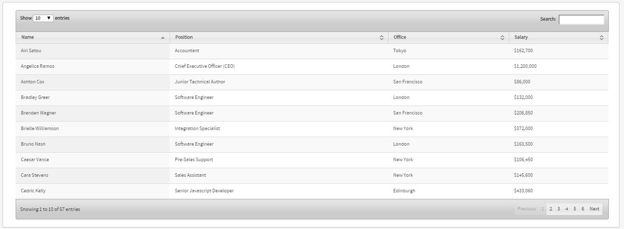
<table id="example" class="display" cellspacing="0" width="100%">
<thead>
<tr><th>Name</th><th>Position</th><th>Office</th><th>Salary</th></tr>
</thead>
<tbody>
<tr><td>Tiger Nixon</td><td>System Architect</td><td>Edinburgh</td><td>$320,800</td></tr>
<tr><td>Garrett Winters</td><td>Accountant</td><td>Tokyo</td><td>$170,750</td></tr>
<tr><td>Ashton Cox</td><td>Junior Technical Author</td><td>San Francisco</td><td>$86,000</td></tr>
<tr><td>Cedric Kelly</td><td>Senior Javascript Developer</td><td>Edinburgh</td><td>$433,060</td></tr>
<tr><td>Airi Satou</td><td>Accountant</td><td>Tokyo</td><td>$162,700</td></tr>
<tr><td>Brielle Williamson</td><td>Integration Specialist</td><td>New York</td><td>$372,000</td></tr>
<tr><td>Herrod Chandler</td><td>Sales Assistant</td><td>San Francisco</td><td>$137,500</td></tr>
<tr><td>Rhona Davidson</td><td>Integration Specialist</td><td>Tokyo</td><td>$327,900</td></tr>
<tr><td>Colleen Hurst</td><td>Javascript Developer</td><td>San Francisco</td><td>$205,500</td></tr>
<tr><td>Sonya Frost</td><td>Software Engineer</td><td>Edinburgh</td><td>$103,600</td></tr>
<tr><td>Jena Gaines</td><td>Office Manager</td><td>London</td><td>$90,560</td></tr>
<tr><td>Quinn Flynn</td><td>Support Lead</td><td>Edinburgh</td><td>$342,000</td></tr>
<tr><td>Charde Marshall</td><td>Regional Director</td><td>San Francisco</td><td>$470,600</td></tr>
<tr><td>Haley Kennedy</td><td>Senior Marketing Designer</td><td>London</td><td>$313,500</td></tr>
<tr><td>Tatyana Fitzpatrick</td><td>Regional Director</td><td>London</td><td>$385,750</td></tr>
<tr><td>Michael Silva</td><td>Marketing Designer</td><td>London</td><td>$198,500</td></tr>
<tr><td>Paul Byrd</td><td>Chief Financial Officer (CFO)</td><td>New York</td><td>$725,000</td></tr>
<tr><td>Gloria Little</td><td>Systems Administrator</td><td>New York</td><td>$237,500</td></tr>
<tr><td>Bradley Greer</td><td>Software Engineer</td><td>London</td><td>$132,000</td></tr>
<tr><td>Dai Rios</td><td>Personnel Lead</td><td>Edinburgh</td><td>$217,500</td></tr>
<tr><td>Jenette Caldwell</td><td>Development Lead</td><td>New York</td><td>$345,000</td></tr>
<tr><td>Yuri Berry</td><td>Chief Marketing Officer (CMO)</td><td>New York</td><td>$675,000</td></tr>
<tr><td>Caesar Vance</td><td>Pre-Sales Support</td><td>New York</td><td>$106,450</td></tr>
<tr><td>Doris Wilder</td><td>Sales Assistant</td><td>Sidney</td><td>$85,600</td></tr>
<tr><td>Angelica Ramos</td><td>Chief Executive Officer (CEO)</td><td>London</td><td>$1,200,000</td></tr>
<tr><td>Gavin Joyce</td><td>Developer</td><td>Edinburgh</td><td>$92,575</td></tr>
<tr><td>Jennifer Chang</td><td>Regional Director</td><td>Singapore</td><td>$357,650</td></tr>
<tr><td>Brenden Wagner</td><td>Software Engineer</td><td>San Francisco</td><td>$206,850</td></tr>
<tr><td>Fiona Green</td><td>Chief Operating Officer (COO)</td><td>San Francisco</td><td>$850,000</td></tr>
<tr><td>Shou Itou</td><td>Regional Marketing</td><td>Tokyo</td><td>$163,000</td></tr>
<tr><td>Michelle House</td><td>Integration Specialist</td><td>Sidney</td><td>$95,400</td></tr>
<tr><td>Suki Burks</td><td>Developer</td><td>London</td><td>$114,500</td></tr>
<tr><td>Prescott Bartlett</td><td>Technical Author</td><td>London</td><td>$145,000</td></tr>
<tr><td>Gavin Cortez</td><td>Team Leader</td><td>San Francisco</td><td>$235,500</td></tr>
<tr><td>Martena Mccray</td><td>Post-Sales support</td><td>Edinburgh</td><td>$324,050</td></tr>
<tr><td>Unity Butler</td><td>Marketing Designer</td><td>San Francisco</td><td>$85,675</td></tr>
<tr><td>Howard Hatfield</td><td>Office Manager</td><td>San Francisco</td><td>$164,500</td></tr>
<tr><td>Hope Fuentes</td><td>Secretary</td><td>San Francisco</td><td>$109,850</td></tr>
<tr><td>Vivian Harrell</td><td>Financial Controller</td><td>San Francisco</td><td>$452,500</td></tr>
<tr><td>Timothy Mooney</td><td>Office Manager</td><td>London</td><td>$136,200</td></tr>
<tr><td>Jackson Bradshaw</td><td>Director</td><td>New York</td><td>$645,750</td></tr>
<tr><td>Olivia Liang</td><td>Support Engineer</td><td>Singapore</td><td>$234,500</td></tr>
<tr><td>Bruno Nash</td><td>Software Engineer</td><td>London</td><td>$163,500</td></tr>
<tr><td>Sakura Yamamoto</td><td>Support Engineer</td><td>Tokyo</td><td>$139,575</td></tr>
<tr><td>Thor Walton</td><td>Developer</td><td>New York</td><td>$98,540</td></tr>
<tr><td>Finn Camacho</td><td>Support Engineer</td><td>San Francisco</td><td>$87,500</td></tr>
<tr><td>Serge Baldwin</td><td>Data Coordinator</td><td>Singapore</td><td>$138,575</td></tr>
<tr><td>Zenaida Frank</td><td>Software Engineer</td><td>New York</td><td>$125,250</td></tr>
<tr><td>Zorita Serrano</td><td>Software Engineer</td><td>San Francisco</td><td>$115,000</td></tr>
<tr><td>Jennifer Acosta</td><td>Junior Javascript Developer</td><td>Edinburgh</td><td>$75,650</td></tr>
<tr><td>Cara Stevens</td><td>Sales Assistant</td><td>New York</td><td>$145,600</td></tr>
<tr><td>Hermione Butler</td><td>Regional Director</td><td>London</td><td>$356,250</td></tr>
<tr><td>Lael Greer</td><td>Systems Administrator</td><td>London</td><td>$103,500</td></tr>
<tr><td>Jonas Alexander</td><td>Developer</td><td>San Francisco</td><td>$86,500</td></tr>
<tr><td>Shad Decker</td><td>Regional Director</td><td>Edinburgh</td><td>$183,000</td></tr>
<tr><td>Michael Bruce</td><td>Javascript Developer</td><td>Singapore</td><td>$183,000</td></tr>
<tr><td>Donna Snider</td><td>Customer Support</td><td>New York</td><td>$112,000</td></tr>
</tbody>
</table>
It displays the following table when rendering the DynaForm:
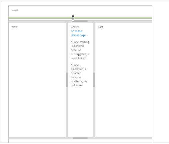
If using the external library "Layout" from JQuery and using its functions inside a table, like the following:
<div id='layout100' style='height:500px;width:500px'>
<div class="ui-layout-center">Center
<p><a href="http://layout.jquery-dev.com/demos.html">Go to the Demos page</a></p>
<p>* Pane-resizing is disabled because ui.draggable.js is not linked</p>
<p>* Pane-animation is disabled because ui.effects.js is not linked</p>
</div>
<div class="ui-layout-north">North</div>
<div class="ui-layout-south">South</div>
<div class="ui-layout-east">East</div>
<div class="ui-layout-west">West</div>
</div>
When rendering the form, the table will have the following characteristics:
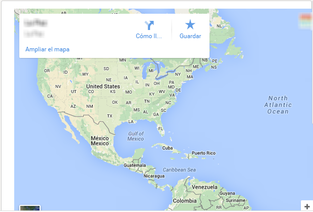
Let's add a Google Map inside a form by adding the following HTML5 code to the content of a panel:
<iframe src="https://www.google.com/maps/embed?pb=!1m18!1m12!1m3!1d122402.16148655002..." width="600" height="450" frameborder="0" style="border:0"></iframe>
When rendering the form, the map is shown as:
The Panel control allows adding any type of content inside the form. If trying to insert a video from Vimeo, let's add the following code:
<iframe src="https://player.vimeo.com/video/121840700" width="500" height="207" frameborder="0" webkitallowfullscreen mozallowfullscreen allowfullscreen></iframe>
When rendering the form, the panel will contain:

Try adding different codes, manage functions from the external libraries to the elements of a panel, and create powerful dynamic forms using this property
Border
|
Available in Controls: Panel |
This property allows defining the border size of the Panel property by simply defining this size in px unities. For example, if setting this property as the following:
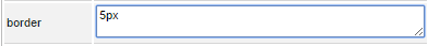
When rendering the form the panel border is shown as the following:

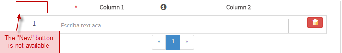
Add Row
| Available in Controls: Grid |
This property sets if the grid will have the "New" button enabled or not by checking or unchecking it. By default, this option is checked, which means the "New" button is enabled when rendering the grid in the form.
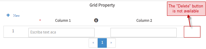
Delete Row
| Available in Controls: Grid |
This property sets if the grid will have the

button enabled or not by checking or unchecking it. By default, this option is checked, which means the button is enabled when rendering the grid in the form.

