- Overview
- Textbox Control
- Managing Textboxes
- Text Control Properties
- Text Control Example
- Textarea Control
- Managing Textareas
- TextArea Control Properties
- Textarea Control Example
- Technical Limitation regarding the Use of the TextArea Control
- JavaScript in Textboxes and Textareas
Overview
ProcessMaker 3 offers two different types of controls for inputting text directly into a form. These are the Textbox and Textarea controls.
Textbox Control
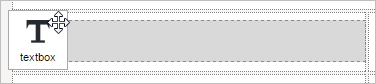
This control adds a text box field where users can input text by typing or pasting it. To add this control to the Dynaform designer, drag the icon below from the Web Controls panel at the left, onto one of the rows in the Dynaform designer.

When added to the Dynaform designer, a text control looks as follows:
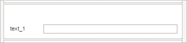
Note: Due to Mozilla Firefox issues, as of Mozilla Firefox 64.0.2, the Dynaform Designer could not properly display the Textbox control horizontally to its label.
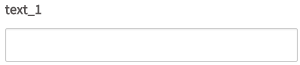
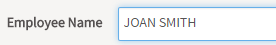
When running a case or in the previewing a Dynaform, a text controls looks as follows:
Managing Textboxes
After adding a textbox to the Dynaform designer, it is possible to customize its functionality and behavior, using the properties panel. Click on the control to display its properties on the panel at the left side of the Dynaform designer.
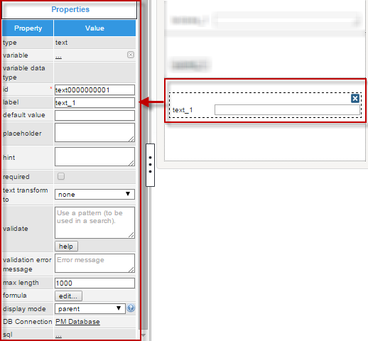
The properties set by default are the following:
- type: Set by default as "
textbox". This definition can not be modified. id: Set by default as
text000000000Xwhere "X" represents the corresponding numbering of the control in the design. This numbering starts in 1. After a variable is related to this control, the ID changes to the name of the variable, nevertheless it is possible to set a new ID to work with the control.- label: Set by default as "
text_X" where "X" represents the corresponding numbering of the control in the design. This numbering starts in 1. - text transform to: Set by default as
"none"which means that the text will be saved just the way the final user input it. - max length: Set by default with the number 1000 which will be the maximum number of characters that a user will be able to input in the textbox.
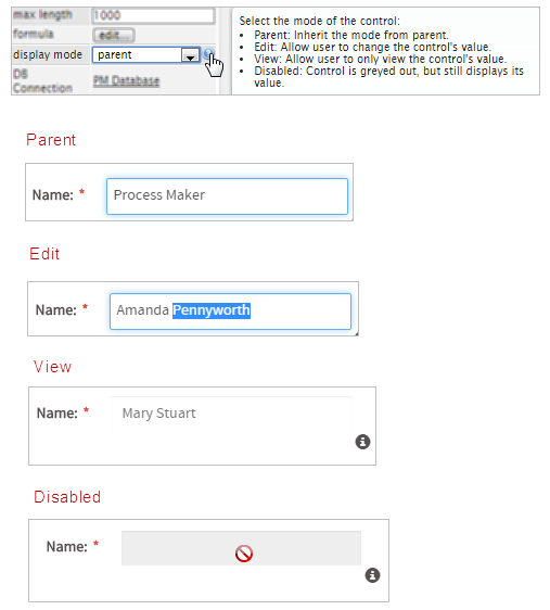
- display mode: Set by default as "
parent". See this documentation for more information of the modes available for this control. - DB Connection: Set by default to "
PM Database". Take into account that if no SQL query is defined in the "sql" property, then no execution will be done. Also, when a variable is related to this control which has its own definition of the connection to a database (an external database or the ProcessMaker'sworkflowdatabase) this property inherits the definition of the variable related in the control.
Text Control Properties
In this section the properties will be extensively explained one by one, to have a better understanding of each. The properties related to this control are the following:
| Property | Description |
|---|---|
| Type | text (readonly) |
| Variable | Click on the ellipsis ... to select a variable from the list of available variables. See this section to learn more of how to relate a variable to a control.
|
| Variable Data type | After a variable has been related to the control, this property shows the data type of the variable (readonly). |
| ID | [Required] Control and HTML unique identifier. |
| Label | In this property set the label to give a name to the control. |
| Default value | Value set by default when the value retrieved is null. To learn more about default values, null values and some other considerations for this property, take a look at this documentation. |
| Placeholder | Set the text that will be shown as help to fill the fields inside the control. |
| Hint | Used to show help when the textbox is rendered. It is shown when the pointer of the mouse is hovered over the question mark (?) icon. |
| Required | By checking this option, an asterisk is added in the label to indicate that the field is required. It means that an option must be selected mandatorily from the control. When a required field is not filled-in with any value, it will not be possible to go to the next step. |
| Text transform to |
|
| Validate | Uses pattern to validate the field (regex). |
| Validation Error Message | Displays this message if the validation fails. |
| Max. Length | Set in this property the max allowed text length |
| Formula | Use this property to create a calculated value based in the operations defined in the formula. Multiple fields in the form can be used in the expression. Arithmetic operations are supported. |
| Display Mode | [Required] Display mode:
|
| DB Connection | For a textbox control, if needing to store a value retrieved from a database, select from the dropdown of this property the database connection that will be used (the connection must be already created in the process, see this section to learn more about it). |
| SQL | Insert in this property, the SQL query to populate the option of the control from database. For a textbox control the value stored in the field will be the first value retrieved from the database.
Note: The SQL property can not repopulate the field if the variables are already filled. The property can repopulate if the field is dependent of another field. Acording to your ProcessMaker version, read the following sections to learn about how this control manages the values retrieved by a SQL query: |
| Options | Define in this property the options that will be used to define the value used in the field.
Note: This property is no longer available in version 3.0.1.5 and later. |
Text Transform To
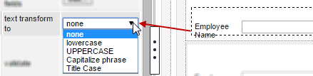
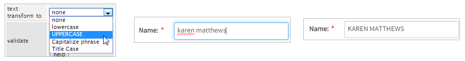
This option transforms any entered text automatically to UPPER CASE, lower case, Capitalize phrase (the first letter is changed to uppercase ), or Title Case (the first letter in every word is changed to uppercase). Select the type of transformation inside the properties of the control.
Changes will be shown when the form is rendered inside the preview or when running a case. For example:
Original text.
Transformed to UPPER case.
Transformed to lower case.
Take into account that leaving it as "none", the text will not have any transformation and will be saved just like the final user entered it.
Max. Length
This property defines the maximum number of characters which can be input into a text control field. This property is also a validation made over these fields, but if a regular expression has been set inside the "Validate" property, this validation will be verified first before the Max. Length.
Theoretically the property definition allows a maximum of 9,999,999,999 characters to be entered into the field, but the web browser probably will not have enough memory to handle that amount of input. Furthermore, ProcessMaker can only store up to 16MB of data about a case, which would be 16,777,216 characters (assuming there are no international characters which need more than 8-bits). On a practical note, it is better to use textareas and file objects to store large amounts of data, since they are stored separately in the database and will not slow down the processing of ProcessMaker, nor are they subject to the same space limitations as textboxes.
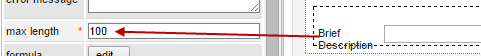
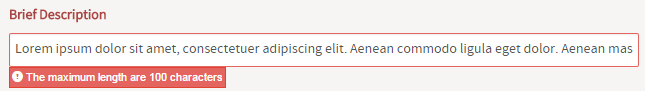
For example, if the max length is set to 100 and the size is surpassed, the following message will be shown:
Note: For this property take into account that a blank space " " is also considered a character.
Formula
Note: Validation rules or masks can be used in the text fields involved in mathematical operations to restrict data input.
This property allows mathematical formulas to be used based on the fields in the Dynaform. The supported mathematical operations are addition, subtraction, multiplication and division. Formulas can also use (...) (parentheses) to group together operations. The fields used in a formula must already exist in the Dynaform. The formula should be placed in the field where the result will be displayed.
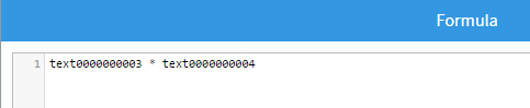
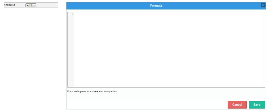
Click on the "Edit" button in the "Formula" property of the text control:
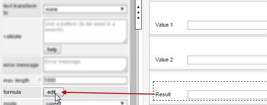
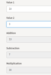
In this example, the field "Result" will show the result of the multiplication between "Value 1" and "Value 2". Nevertheless, take into account that the formula must be made using the ID of those text controls, then the formula to be entered would be:
When running a case, the fields that have configured a formula are disabled to input text. The results of the mathematical operations are shown as the values are entered in the fields included in the formula.
The formulas can consist of the IDs of text fields, numbers and the following mathematical operators:
| Operator | Description | Example |
|---|---|---|
+ | Addition | salesPrice + tax |
- | Subtraction | salesPrice - discount |
* | Multiplication | salesPrice * quantity |
* | Division | pounds / 2.2046226 |
(...) | Grouping | (currentSales - previousSales) / previousSales |
Multiplication and division have higher precedence than addition and subtraction. In the following formula:
First, the discount is multiplied by the taxRate, then the result is subtracted from price. Parentheses can be used to change the order of the mathematical operations:
Now, the discount is subtracted from the price, then the result is multiplied by the taxRate.
The results of the calculation are displayed in the field containing the formula the moment that the user changes the value of one of the fields used in the formula. If the user enters a value in a field which can't be interpreted as a number, then the field containing the formula will blank (i.e., set to an empty string). To force the user to only enter valid numbers in fields, it is recommended to either use a mask or set the validate property to only accept numbers:
- Only integers:
^\d+$ - Only positive or negative integers:
^[\-+]?\d+$ - Integers or decimal numbers:
^[\-+]?\d*\.?\d*$ - Number with up to two decimal digits:
^[\-+]?\d*(\.\d{0,2})?$ - Number with exactly two decimal digits:
^[\-+]?\d*\.\d{2}$
Note: In order for formulas to work correctly, the numbers entered by the user into fields should NOT have a thousands separator and should use . (period) as the decimal separator, such as: 1234567.89
If needing to use numbers like 123,456,789.01 (comma as thousands separator), 123 456 789.01 (space as thousands separator) or 123.456.789,01 (dot as thousands separator and comma as decimal separator), then add custom JavaScript that uses control.setOnchange() to do the calculation.
Formulas can also be used in text fields found in grids. Formulas in grids can only contain the IDs of other fields in the same row in the grid, so it is not possible to reference fields outside the grid or fields in other rows in the grid. If needing to do calculations based on fields outside the grid, it is recommended to add JavaScript code that uses form.setOnchange() to set an event handler which calculates the formula when a value in the grid changes.
Validate
This property allows a regular expression to be entered which checks whether the user entered valid input into the textbox. If the input matches the regular expression, then the user will be allowed to leave the field, but if the input doesn't match, the field message will be outlined in red and the text in the Validation Error Message property will be displayed. The user will not be allowed to leave the field until its input is changed to match the regular expression.
Regular Expression Syntax
This is a brief introduction to regular expressions which can be used in the validate property to check whether the user has entered valid input into a textbox.
Matching strings of characters
To match any string of characters, use them in the regular expression. For example, a validate property of th would accept any input which contains the letters th, such as thumb, something and Smith. However, it would not accept Tom Thumb because regular expressions are case sensitive.
Beginning of text: ^
Notice that the regular expression may occur anywhere in the text. To specify that the regular expression must occur at the beginning of the text, precede it by ^. For example, a validate property of ^Sm would accept Smith and Smothers, but would not accept John Smith or SSSSmeeegol! because Sm doesn't occur at the beginning of the text.
End of text: $
Likewise, to specify that the regular expression must occur at the end of the text, add $ after the string of characters to match. For example, a validate property of 2X$ would accept Size 2X and 42X, but would not accept 2X larger or UA2XFR because 2X is not found at the end of the text.
To match the complete text, then use both ^ before the string of characters to match and $ at the end of the string of characters. For example, ^yes$ would only allow the user to enter yes in the field. It would not match yes or Tell me yes.
Escaping characters: \
If searching for text which contains ^ or $ or any of the other special characters used by regular expressions, place a \ (backslash) in front of them, which will escape them so they are treated as literals. For example, the regular expression \$10 would accept the text the price is $10.99. In the regular expression ^4\^3, the string of characters 4^3 must occur at the beginning of the text.
Any character: .
Use a . (period) to match any character except a new line. For example, UX..0 matches UX500-200, Serial YUX_R034-200 and MUX %0. If needing to search for a period, then escape it with a preceding \ (backslash). For example 0\.0 would match 0.045% and 230.00.
Character set: [xyz]
To match any character in a set of characters, enclose the characters inside [] (square brackets). For example, c[oal] would match cop, cat and blood clot, but it would not match crew, because r isn't in the character set.
It also will not match cLop because the character set is case sensitive. To make it case insensitive, use [cC][oalOAL], so it will match Cop, cAt or CLEAN.
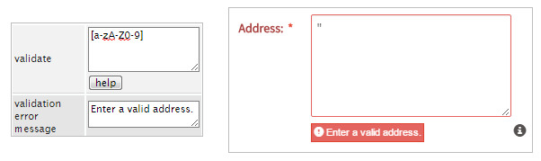
To match a range of characters, then use - to specify any character between two characters. For example, use [ad-fm] to match the characters a, d, e, f or m. The regular expression [a-zA-Z0-9] matches any lowercase or uppercase letter or any number. Letters which are not in the ASCII character set are not included in the range [a-z], so remember to include them if the users are working with languages which have other letters. For example, [a-záéíóúüñA-ZÁÉÍÓÚÜÑ] includes all the letters in Spanish.
Inside [] (the square brackets), all characters such as $*.?() are treated as literals and do not have a special meaning. To include -, [, ] or \ in the character set, escape them with a preceding \ (backslash). For example, [!@#$%*(){}\[\]_\-+=/\\|<>~] includes most of the standard symbols.
Negated character set: [^xyz]
To match any character which is not in a set of characters, enclose the characters inside [^ ] (open square bracket, caret, close square bracket). For example, g[^aeiou] would match g followed by any character which is not a vowel, such as grow and bog!.
Occurs 0 or 1 times: ?
If the preceding expression can either not occur or occur once, place a ? (question mark) after it. For example, tr?ee matches both tee-shirt and oak tree. If placed after a character set, any of the characters in the set can occur zero or one times. For example, c[rl]?aw matches bear claw, sticks in my craw and crow's cawing.
Occurs 0, 1 or more times: *
If the preceding expression can zero, one or more times, place a * (asterisk) after it. For example, me*t matches met, meeting and mt Everest. If placed after a character set, any of the characters in the set can occur zero, one or more times. For example, \$[0-9]* matches $0, price: $2346 and give me $ now.
Occurs 1 or more times: +
If the preceding expression can occur one or more times, place a + (plus sign) after it. For example, me+t matches met and meeting, but it doesn't match mt Everest because the e has to occur at least once between the m and t. Likewise, \$[0-9]+ matches $0 and price: $2346, but it doesn't match give me $ now because there has to be at least one number after the dollar sign.
Occurs a fixed number of times: {n}
If the preceding expression occurs a fixed number of times, specify the number inside {} (curly braces). For example, bo{2}g would match boogyman, but not bogeyman because o has to occur two times in a row. The regular expression ^[0-9]{4}$ would only accept a positive integer with 4 digits such as 2406 or 0987. Likewise, ^[-+]?[0-9]{4}\.[0-9]{2}$ would only accept positive or negative numbers with 4 digits and 2 decimal digits, such as 2324.99 or -0876.08.
Occurs a range of times: {n, m}
If the preceding expression occurs between n and m number of times, then specify the lower range and the upper range inside {} (curly braces). For example, bo{2,4}g would match boogyman and It's a booooger!, but not wet bog and not four boooooooogies!. The regular expression ^[0-9]{1,3}$ would only accept a positive integer between 1 and 3 digits long, such as 3, 87 or 097. Likewise, ^[-+]?[0-9]{1,4}\.?[0-9]{0,3}$ would only accept positive or negative numbers with between 1 and 4 digits and between 1 and 3 decimal digits, such as 4.999 or -0876.
The lower range or the upper range does not need to be specified. For example, ^[0-9]{2,}$ would accept any positive integers with 2 or more digits. Likewise, ^[0-9]{,5}$ would accept any positive integer with 5 or less digits.
Grouping: (xyz)
To group together a string of characters place them inside () parentheses. Grouping can be especially useful when combined with ?, *, +, or {}. For example, R(IP)* would match GRIP, RIPIPIPIPIPPPP and Turn Right. The regular expression (99)+ would match 234993 and 78.99999, but not match 239239 because 9 doesn't occur twice in a row.
Or: x|y
To match one or another expression, separate them by | (a vertical bar). For example, cat|dog matches I love cats and bad doggie!. There is no limit to the number of alternative strings of characters which can be matched, so many types of pets can be matched with cat|dog|fish|bunny|snake|ferret. If the alternative strings are found within a larger string of characters, then enclose the alternatives strings inside () parentheses. For example, bad (check|contract)s? would match It's a bad check and bad contracts kill business.
Word boundary: \b
To search for a word boundary, use \b. A word only consists of letters, numbers and underscores [a-zA-Z0-9_]. When a word is next to any other character or the end or the beginning of the text, it is considered a word boundary. The blue vertical lines in the following text are considered word boundaries: |Can|'|t| |say| "|hello|," |can| |you|?
Word boundaries can be useful when searching for separate words. For example, a search for cat would match cattle, caterpiller and hellcat, but \bcat\b would only match text which contains the separate word "cat" such as Give me the cat. and cat. A more flexible search for "cat" would allow the word to be capitalized or pluralized: \b[Cc][aA][aT][sS]?\b
Note: Words do not include non-ASCII letters such as ü, é, ñ, φ or あ, so it isn't very useful when dealing with languages other than English. A good way to get around this problem is to use a character set for the language. For example, (^|[^a-záéíóúüñA-ZÁÉÍÓÚÜÑ])gato($|[^a-záéíóúüñA-ZÁÉÍÓÚÜÑ]) would search for the separate word gato in the Spanish language.
Not word boundary: \B
To search for a string which does not occur next to a word boundary, use \B (note the uppercase B). For example, \Bman would match cattleman and humane, but not match help the man and manhole.
Word boundaries can be useful when searching for separate words. For example, a search for cat would match cattle, caterpiller and hellcat, but \bcat\b would only match text which contains the separate word "cat" such as Give me the cat. and cat's gut. A more flexible search for "cat" would allow the word to be capitalized or pluralized: \b[Cc][aA][aT][sS]?\b
Non-greedy: ?
It is often useful to use expressions such as .* which matches any number of characters or [a-zA-Z]* which matches any number of letters, but these expressions do not work correctly if needing to search for text which follows afterwards. For example, serial.*UX48 would not match serial RX-UX48, because .* would keep matching all the characters until the end of the text, which would never see the UX48 part. This is called being greedy. To tell the regular expression to not be greedy, and check whether the text which is being eaten by .* matches what follows afterwards, add ? (a question mark). The regular expression serial.*?UX48 is able to match serial RX-UX48 as expected.
Get more information
This is just a brief introduction to regular expressions and there are more special characters which can be used. To learn more, see the documentation on JavaScript's RegExp and read this tutorial on regular expressions.
Example Regular Expressions
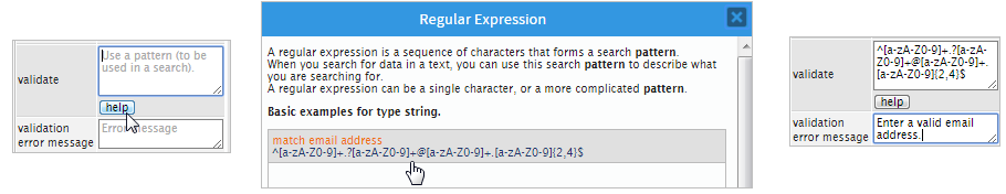
ProcessMaker provides some example regular expressions which can be inserted into the validate property. To see the list of examples, click on the Help button. Then, click on one of the examples in the list to insert it and then it can be customized to fit your needs.
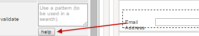
A window opens with the examples of regular expressions that can be used in this property. To use any of them simply click on the option needed.
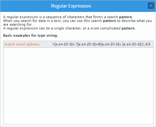
The regular expression selected will be inserted in the value of the property where the corresponding editions can be made to customize the validation.
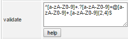
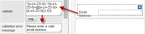
As in the image above, the regular expression used to validate an email address provided by the help option of this property is the following:
This regular expression verifies that the first section of email address contains letters in upper or lower cases and/or numbers from 0 to 9 in the expression [a-zA-Z0-9]. Then, the expression verifies that the email address is followed one special character optionally, and again letters and/or numbers after it in the expression .?[a-zA-Z0-9]. As this validation is made for an email address, the validation also verifies that the address contains the "@" character followed again by characters that contain letters and/or numbers, a dot and after it more letters and/or numbers.
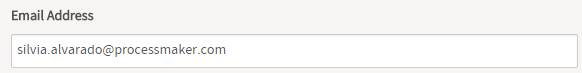
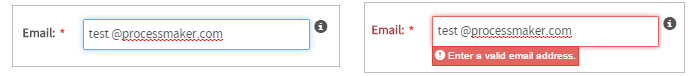
If using the validation shown before, when rendering the form the validation will be shown as the image below when entering a valid email address.
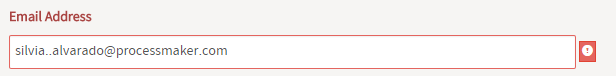
For an invalid email address, the warning will be shown when the event OnChange() is triggered.
Validation Error Message
This property is related to the Validate property and simply sets the message error shown in case the evaluation for the field is "False".
For the example of the email address validation, let's set the error message seen in the following image:
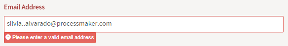
When rendering the form and entering an invalid email address, the message will be displayed:
Text Control Example
For this example drag and drop a "Text" control from the left hand panel into the Dynaform canvas.
Immediately after adding the control the Create Variable window will pop up. Create or Select a new variable and then click on the "Save" button to add this variable to the control.
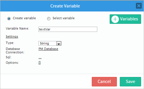
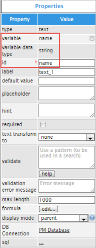
Now, go to the properties of the control by clicking on any emty space of the control and its properties will be displayed on the left hand panel. Observe that the a variable "name" has been created and it is already added.
The next property is the "default value" property which will set a predefined value for the field, if it doesn't contain any. When/if a default value is set, this property will override the "SQL" and "Options" properties. For example if the value is "Mr." like in the example below, then the user can choose to erase the "Mr." value or simply continue after that and add the following: "Mr. Donahue".

The "placeholder" property will show help to fill a field. For example add "Mr. Miss. Ms." into the placeholder property and when running a case the value added into the control will be seen in a read-only manner.

Click on the "required" checkbox to add more functionality to the control. This property will add a red asterisk meaning that if the field is not filled then an error message will be shown like in the image below:

Now the "text transforms to" property will transform the text into all lowercase, all uppercase, phrase capitalization or title case. For this example choose UPPERCASE. When running a case the field will capitalize anything written on it. Observe the images below.
The "validation" and " validation error message" properties work with regular expressions to validate what its written into the control. For example if the control asks for an email address the validation can check if the email written is valid or not. And the "validation error message" property can be changed to: "Enter a valid email address".
Therefore, when running a case the "text" control will have a validation involved. For example if the email added has an space: "test @processmaker.com" then a validation error will appear as shown in the image below.
Now, the "max length" property will control the maximum length of a text added. By default the "max length" is set to 1000, but if it's changed like for example to 10 then it should not let a user write more than 10 characters.

The "formula" property allows to add a formula as seen in the section Formula of this document.
The "display mode" property will present the following changes when its different options are changed.
The "DB Connection" and "sql" properties allows to connect ProcessMaker with a Database and therefore store all data. The "Db Connection" property shows the name of the connection to the ProcessMaker database ("PM Database") or to an existing connection inside the process to an external database. Click on the ellipsis ... on the "sql" property to open the "Sql Editor" and add code. For this example, the "text" control will act as a dependent field, depending on the "Country", and "Subdivision" and the text control will show the exact location.
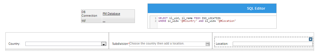
For example, if the country is "United States", then the subdivision is "Nebraska" then automatically the "Location" will change to the first city in Nebraska which is Alliance (AIA), Nebraska as seen in the image below.

Note: This is an example with a text control but this code will work better with a control such as dropdown because the control would be populated with more options.
Textarea Control
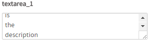
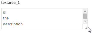
A textarea control allows more than one line of text to be input into a field. Lines of text which are wider than the width of the textarea will automatically be wrapped. Textareas which have 3 rows or more will display a vertical scroll bar.

After adding a textarea control in the designer, it will look like the following image:
When running a case, textarea controls looks like the image below:
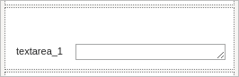
Though this control displays a vertical scroll bar if more than three lines are inserted, the input box can be expanded according to the necessity. To do this, simply click on  at the lower right-hand corner of the input box of the textarea control and without releasing the button of the mouse, enlarge or shrink it until the desired size.
Note: The browsers Internet Explorer 11 and Microsoft Edge do not support the property of expanding the "Textarea" control. This is a known issue on the part of Microsoft browsers, for more information, please visit: this page.
Managing Textareas
After adding a textarea control to the designer, it is possible to customize its functionality and behavior, using the properties panel.
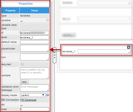
The properties set by default are the following:
- type Set by default as "
textarea". This definition can not be modified. id Set by default as
textarea000000000Xwhere "X" represents the corresponding numbering of the control in the design. This numbering starts in 1. After a variable is related to this control, the ID changes to the name of the variable, nevertheless it is possible to set a new ID to work with the control.- label Set by default as "
textarea_X" where "X" represents the corresponding numbering of the control in the design. This numbering starts in 1. - display mode Set by default as "
parent". See this documentation for more information of the modes available for this control. - DB connectionSet by default to "
PM Database". Take into account that if no SQL query is defined in the "sql" property, then no execution will be done. Also, when a variable is related to this control which has its own definition of the connection to a database (an external database or the ProcessMaker'sworkflowdatabase) this property inherits the definition of the variable related in the control. - rows Set by default as 5. This is the number of rows of text which will be shown initially before a scroll appears on the right side of the control.
TextArea Control Properties
The properties related to this control are the following:
| Property | Description |
|---|---|
| Type | textarea (readonly) |
| Variable | Click on the ... option to select the variable from the list of available variables. See this section to learn more of how to relate a variable to a control.
|
| Variable Data Type | After a variable has been related to the control, this property shows the data type of the variable (readonly). |
| ID | [Required] Control and HTML unique identifier. |
| Label | Set the label of the control in this property |
| Default value | Value set by default when the value retrieved is null. To learn more about default values, null values and some other considerations for this property, take a look at this documentation. |
| Placeholder | Set the text that will be shown as help to fill the field inside the field. |
| Hint | Used to show help when the textarea is rendered. It is shown when the pointer of the mouse is hovered over the ? icon. |
| Required | By checking this option, an asterisk is added in the label to indicate that the field is required. It means that an option must be selected mandatorily from the control. When a required field is not filled in with any value, it will not possible to go to the next step. |
| Validate | Use pattern to validate field (regex) |
| Validation Error Message | Display this message if the validation (the property above) fails |
| Display Mode | [Required] The display mode for the control could be:
|
| DB Connection | For a teaxarea control, if needing to store a value retrieved from a database, select from the dropdown of this property the database connection that will be used (the connection must be already created in the process, see this section to learn more about it). |
| SQL | Insert in this property, the SQL query to populate the option of the control from database. For a textarea control the value stored in the field will be the first value retrieved from the database. Note: The SQL property can not repopulate the field if the variables are already filled. The property can repopulate if the field is dependent of another field. Acording to your ProcessMaker version, read the following sections to learn about how this control manages the values retrieved by a SQL query: |
| Options | Define in this property the options that will be used to define the value used in the field.
Note: This property is no longer available in version 3.0.1.5 and later. |
| Rows | Defines the number of lines supported by the textarea before a scroll is added at the right side |
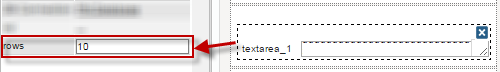
Rows
Available Version: ProcessMaker 3.0.1.5 and later
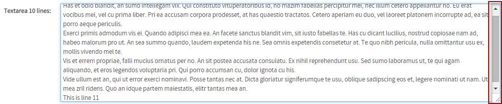
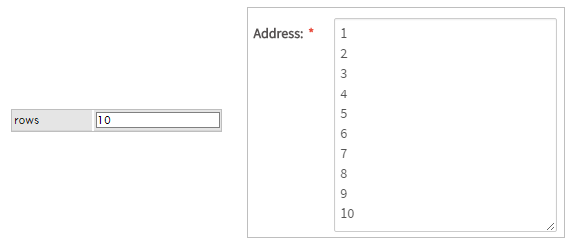
This property defines the number of rows the textarea will have/show before adding a scroll at the right side of the input box. This property can not be tested inside the designer, it is necessary to render the form whether in the Preview or when running cases. For example if setting this property with "10" in the designer.
After rendering the form in the "Preview", first add ten lines to the textarea and then more then ten lines to view how the property works.
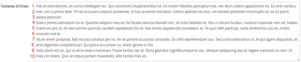
When there are more than 10 lines, a scroll is shown at the right side:
Note: This property does not have any effect inside grids due to the amount of controls that grids handle at the same time, and the look and feel for the grid would change dramatically. Inside grids only one row is shown at a time.
Textarea Control Example
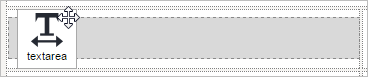
For this example add a "textarea" control by dragging and dropping it onto the Dynaform canvas.
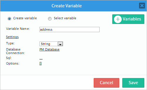
Immediately after adding the control the Create Variable window will pop up. For this example create a variable named "address" and in the "Settings" section add any extra configuration needed for this variable. After finishing, click on the "Save" button to add the new created variable to the control.
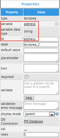
Now that the variable has been added, click on any empty space of the "TextArea" control and its properties will display on the left hand panel. Observe that the "variable", "variable data type" and "id" properties have changed because the variable has been created before hand.
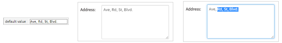
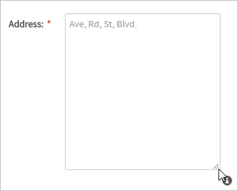
The "default value" property can be changed to "Ave, Rd, St, Blvd." Remember that having a default value means it will override the "SQL" and "Options" properties.
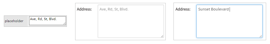
The "placeholder" property will add an specific text within the control which will disappear once the user starts introducing text into the control. Observe the images below.
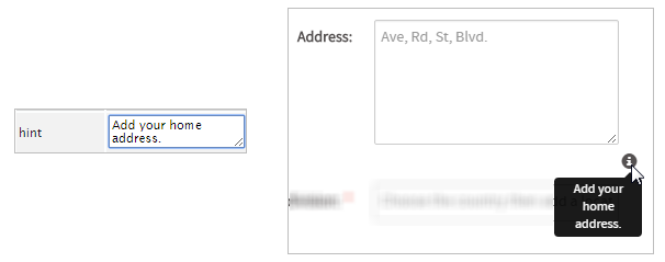
Now the "hint" property will show help with an with an information (i) icon next to it. Hover the pointer of the mouse over the icon to show what has been written as a hint for this field.
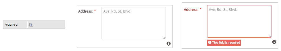
The "required" property checkbox validates if there is text inside the control. It makes the field required so the user has to mandatorily fill it with text. An error message will appear if it has not been filled.
The "validation" and the "validation error message" properties work together to use a pattern an validate the text written in the control. Many complicated validations can be used, for example use the validation for an email address: ^[a-zA-Z0-9]+.?[a-zA-Z0-9]+@[a-zA-Z0-9]+.[a-zA-Z0-9]{2,4}$. But for this case use a simple validation for a home address which is: [a-zA-Z0-9], so when running a case it will validate the text written inside the control as seen in the image below.
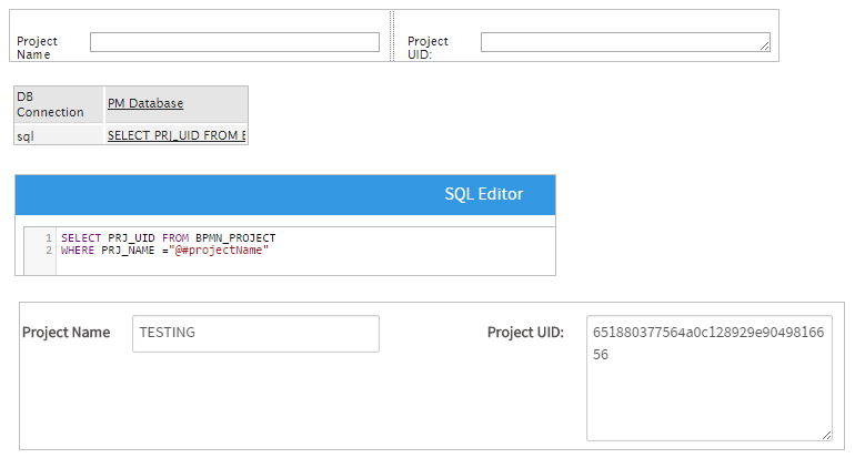
The "DB Connection" property is used to select between the list of database connections defined in the process objects. For the "sql" property the example will be different by using a dependent field. For this example, add a "text" control and a "textarea" control (which will use an sql query). The first control will be named "Project Name" and will have a variable named "projectName" so the "Textarea" control can be populated with the information required in the first control. Click on the SQL ellipsis ... on the "TextArea" control to open the "SQL Editor" window and add the following code:
WHERE PRJ_NAME = "@#projectName"
When the code is added click on the "Save" button and a part of the code will appear on the "sql" property which means the code has been save correctly. When running a case one will add the name of a project in the "text" control and obtain a long line of numbers in the "textarea" control which is the UID of that particular project in the "Textarea" control.
Because it is a "Textarea" control it has the property of expanding itself to adjust with the text. Expand it by clicking on the lower right corner as shown in the image below
Note: The browsers Internet Explorer 11 and Microsoft Edge do not support the property of expanding the "Textarea" control. This is a known issue on the part of Microsoft browsers, for more information, please visit: this page.
The final property for this control is "rows" , this is the number of rows of text which will be shown initially. The default number of rows is 5 but for this example it has been changed to 10 as seen in the image below.
Technical Limitation regarding the Use of the TextArea Control
When you work editing text for a trigger in the TextArea Controls by setting up the Display Mode in "disabled" or "view" mode, you display text contents according the following configuration:
- disabled: HTML tagging is not recognized, so whatever written expression keeps its original text.
- view mode: HTML tagging is recognized, so standard HTML notation is applied on text.
The configured TextControl Area cannot be displayed in the same way given the nature of how rendering process is applied in each of these settings.
JavaScript in Textboxes and Textareas
To learn how to manage Dynaform fields using JavaScript, see JavaScript in Dynaforms.
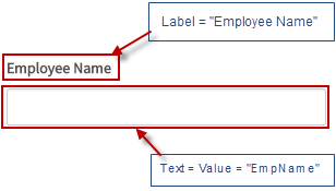
Textboxes and textareas in ProcessMaker 3 have the following field components:
- Label: The text displayed above or to the left of the field to identify it to the user.
- Text: The text displayed inside the field.
- Value: The stored value for the field. For textboxes and textareas, the text and the value are the same.
JavaScript Methods
Some of the JavaScript methods to manipulate textboxes and textareas include:
| Method | Description |
|---|---|
jQuery("#fieldID").getControl() |
Use this function to obtain the control's input field, rather the its DIV which is obtained with |
jQuery("#fieldID").disableValidation() |
Disable the validation of the field, so it doesn't check the regular expression in the validate property and whether the field is required when the form is submitted. |
jQuery("#fieldID").enableValidation() |
Enable validation of the field, so it will check the regular expression in the validate property and whether the field is required when the form is submitted. |
jQuery("#fieldID").getValue() |
Returns the value of the field, which is what is stored by the field. Note that getValue() and getText() return the same thing in textboxes and textareas. |
jQuery("#fieldID").getText() |
Returns the text of the field, which is what is displayed in the field. Note that getValue() and getText() return the same thing in textboxes and textareas. |
jQuery("#fieldID").getLabel() |
Returns the field's label, which is the text displayed above or to the left of the field to identify it. |
jQuery("#fieldID").setValue("newValue") |
Sets a new value in the field, which is what is stored in the field. |
jQuery("#fieldID").setText("newText") |
sets a new text in the field, which is what is displayed to the user. Note that for textboxes and textareas, setText() is the same as setValue(). |
jQuery("#fieldID").setLabel("newLabel")
|
Change the field's label, which is the text displayed above or to the left of the field to identify it. |
jQuery("#fieldID").setOnchange(function(newVal, oldVal){...}) |
Define a change event handler, which is a custom function that executes after the value of the field changes. The function may contain the following parameters:
|
To see code examples for these methods, see JavaScript Functions and Methods.
Custom change event handler
To run custom code after the user finishes entering a new value in a textbox or textarea, an event handler can be assigned to the field's change event.
For example, the following code is used to check the input in a textbox with the ID "productCode". When the focus leaves the field, the code automatically removes any spaces and converts the input to uppercase. Then, it verifies that the user entered a valid serial number in the format "S[0-9][0-9][XYT][0-9]", such as "S38X7" or "S08T2". If it is a valid serial code, then it sets the modified value in the textbox. Otherwise, it displays an alert message, informing the user that the serial number is invalid.
val = this.value.trim(); //remove leading and trailing spaces
val = val.toUpperCase();
re = /^S[0-9][0-9][XYT][0-9]$/;
if (val.match(re)) {
//set transformed value in the "serial" field:
$("#productCode").setValue(val);
}
else {
alert(this.value + " is invalid.\nUse serial numbers like 'S[0-9][0-9][XYT][0-9]'.");
}
} );
Filtering keys with JavaScript
The validate property can be useful for verifying the input in a field, but it only happens during a change event when the focus leaves the field. To prevent the user from entering invalid input in a field, it can be useful to filter out key presses for invalid characters by returning false in the event handler for the keydown, keypress or keyup events.
For example, the following keydown event handler only allows characters used in numbers to be entered into a textbox with the ID "amount":
var key = e.keyCode;
if ((key <= 46 && key != 16) || //allow control keys, but not SHIFT
(key >= 48 && key <= 57) || //numbers 0-9
(key >= 96 && key <= 105) || //number pad 0-9
key == 107 || //number pad +
key == 109 || //number pad - (minus)
key == 110 || //number pad . (period)
key == 173 || //- (dash on Mozilla)
key == 189 || //- (dash on IE)
key == 190) //. (period)
return true;
else
return false;
} );
event.keyCode to see which key was pressed, but different web browsers can use different key codes. To get the different key codes, see this list or go to http://keycode.info/ and press a key to check its key code.
Of course, this code doesn't check whether a valid number is entered, so it is possible to enter nonsense such as 98-2..-873 in the field. The only solution is to either add additional code to the keydown event handler to check for invalid input, but in many cases it is much easier to either use a regular expression in the field's validate property or write a custom change event handler to handle invalid input.

