- Overview
- Field Name
- Label
- CSS for Labels
- Accessing Labels with JavaScript
- Normal Input Field Labels
- Titles and Subtitle Labels
- Button Labels
- Setting an ID for Labels
- Grid Field Labels
- Multilingual Labels
- Enable HTML
- Max. Length
- Validate
- Mask
- Required
- Read Only
- Resizable
- Formulas
- Hint
- Dependent Fields
- Default Value
- Size
- Mode
- SQL Connection
- SQL
- Option
Overview
Field properties specify the appearance, behavior, options and values of a Dynaform field. Field properties that are shared by multiple types of fields are detailed here. For information about properties that are only used by a single field type, see the wiki entry for that particular field type.
Field Name
| Used by: All Fields. |
A case-sensitive name between 3 and 64 characters long that identifies the field. Data entered into the field on the Dynaform will be saved as a case variable with the name entered in the Field Name property. This case variable can be accessed in subsequent conditions and triggers in the case (as long as the user clicks the submit button or the form is set to automatically save the data). Normal PHP variable naming rules apply, so the name must start with a letter or underscore and can only contain letters, numbers and underscores. DO NOT to use dash to separate a field name. ie: Last-Name
Note: Field names are constants and can not be changed with JavaScript.
XML definition:
Label
| Used by: textbox, currency, percentage, password, suggest, textarea, title, button, submit, reset, dropdown, yesno, listbox, checkbox, checkgroup, radiogroup, date. |
The label of the control field displayed on the Dynaform. Labels can contain a maximum of 255 characters. If longer labels are needed, go to the XML tab and enter the text directly into the XML definition of the field.
All labels (except the labels on buttons) can contain HTML formatting tags. For instance, a label could contain:
XML definition:
or
CSS for Labels
To set a consistent style for all labels in ProcessMaker forms, it is recommended to change the Cascading Style Sheet (CSS) definition of .FormLabel in the style.css file for the current skin:
{
color:#808080;
text-align:right;
padding-right:5px;
/* width:180; */
}
To change the font of the labels, add font and color to the CSS definition of .FormLabel or change the default font for form.formDefault table:
{
font:normal 11px sans-serif,MiscFixed;
color:#808080;
line-height:180%;
}
Accessing Labels with JavaScript
By default, field labels do not have an HTML name or id to identify them, so it is more difficult to reference a field label and change its text through its innerHTML property. Nonetheless, field labels are stored in the same row in an HTML table as the field, so it is possible to locate the table cell holding the field's label and set its inner HTML property.
Normal Input Field Labels
For normal input fields, their label can accessed with:
For example, to set the label of the "total" field to "Total (after taxes)":
Titles and Subtitle Labels
Title and Subtitle labels can be accessed with:
For example:
Button Labels
Button labels can be accessed with:
For example:
Setting an ID for Labels
Another way to access field labels is to assign an HTML ID to the label. Most labels (except for the labels on buttons) allow HTML tags to be inserted. For some fields, such as titles, subtitles and checkboxes, the Enable Html option must first be activated to allow HTML tags. Enclose the label within tags which have an ID. Then, the label's text can be easily changed with JavaScript:
For example, a form has a textbox named "Age", which is limited to the input of integers. Its label becomes red with asterisks when an improbable value of less than 5 or greater than 95 is entered. If its label is defined as:
- Enter your age
The label of the control can be altered with the following JavaScript code:
if (parseInt(getField("Age").value) < 5 || parseInt(getField("Age").value > 95)
document.getElementById("AgeLabel").innerHTML =
'<font color="red">**Enter your age**</font>';
else
document.getElementById("AgeLabel").innerHTML = 'Enter your age';
}
getField('Age').onchange = alterLabel;
To save a field's label so its text can later be used in a trigger, save the label to a hidden field, so a case variable will be created when the Dynaform is submitted. For instance, this code saves the label of the "Age" textbox when the form is submitted:
getField("MyHidden").value = document.getElementById("AgeLabel").innerHTML;
return true;
}
Grid Field Labels
To access the labels of grid fields with JavaScript, set the label's id inside HTML tags for the field's label as shown above. Another way to set the label is to find the label through the table structure of the grid.
For example, to set the label of the "clientTelephone" grid field to "Client Fax":
var table = getRow("clientsGrid][1][clientTelephone").parentNode;
var cellIndex = field.parentNode.cellIndex;
table.rows[0].cells[cellIndex].innerHTML = 'Client Fax';
Multilingual Labels
Labels can be specified for different languages by enclosing them inside language tags in the XML, such as <en>... </en> (English), <es>... </es> (Spanish), <pt-br>... </pt-br> (Brazilian Portuguese) or <zh-cn>...</zh-cn> Simplified Chinese. The language tag consists of a 2-letter language code in lower case and an optional two letter country code inside angle brackets. See Installing Additional Translations for a list of available language tags.
To translate a label into another language, log in to ProcessMaker in that language and edit the Dynaform field in the Fields Handler tab. Translate the label into the desired language. When the field's properties are saved, an additional label inside language tags will be added to the field's definition in the XML.
The other way to add additional languages is to manually edit the XML code and add translations for the options inside language tags. Remember to enclose non-ASCII characters (such as "ë", "¿" and "Í") inside an XML character data structure:
For example, the label for the "groupName" textbox is translated into English, Spanish, Brazilian Portuguese and Quechua:
<en>Group name</en>
<es>Nombre del grupo</es>
<pt-BR>Nome do grupo</pt-BR>
<qu><![CDATA[Juñup sutin]]></qu>
</groupName>
A user who logs with English as ProcessMaker's system language will see "Group name" as the textbox's label, whereas users logging in with Spanish, Brazilian Portuguese or Quechua will see "Nombre del grupo", "Nome do grupo" or "Juñup sutin", respectively. If a user logs into ProcessMaker in a language that doesn't have a language tag for the field, then the field's label will be displayed in the first language defined for the field. In this example, that language would be English, since "Group name" is the first label listed in the field definition.
Notice that the Quechua label is enclosed inside a character data structure (<qu><![CDATA[Juñup sutin]]></qu>) because it contains "ñ", which is a non-ASCII character that can't be parsed as normal XML.
Multilingual Labels with JavaScript
To change field labels with JavaScript, find the system language in the current URL in location.href. For example:
switch(lang) {
case 'es':
label = "Apellido"; break;
case 'pt':
label = "Sobrenome"; break;
default:
label = "Last Name";
}
getRow('lastName').cells[0].innerHTML = label;
Multilingual Labels with PHP
To set field labels using a trigger, first create a hidden field in the Dynaform whose value is the text of the new field label and add JavaScript code to set the field label to the value of the hidden field. For example, to set the label of the "lastName" field with the value of the "setLastName" hidden field:
Then, create a trigger that uses the @@SYS_LANG system variable to find the current system language and sets the value of the @@setLastName case variable. Set the trigger to fire before the Dynaform is displayed.
case 'es':
@@setLastName = "Apellido"; break;
case 'pt':
@@setLastName = "Sobrenome"; break;
default:
@@setLastName = "Last Name";
}
Enable HTML
| Used by: title, subtitle, checkbox. |
Select this option to allow HTML formatting tags to be inserted inside the titles, subtitles and labels of checkboxes. If this option is enabled, the text will be enclosed inside a character data structure so it won't be parsed as XML and will be rendered directly as HTML.
XML definition:
For instance, this title definition:
<en><![CDATA[<b><i><font color="Green">How</i> <small>do I</small></font> <font size="5">look</font>?</b>]]></en>
</MyTitle>
Will appear in the Dynaform as:
Max. Length
| Used by: textbox, currency, percentage, password. |
The number of characters that can be input into the field.
Theoretically, the property definition allows a maximum of 9,999,999,999 characters to be entered into the field, but web browsers probably will not have enough memory to handle that amount of input. Furthermore, ProcessMaker can only store up to 16MB of data for each case, which is about 16,777,216 characters (assuming there are no international characters which need more than 8-bits). On a practical note, it better to use textareas and file objects to store large amounts of data, since they are stored separately in the database and will not slow down the processing of ProcessMaker, nor are they subject to the same space limitations as textboxes.
XML definition:
Max. Length for Textareas
Textareas do not have a Max. Length property, but it can be implemented by setting event handlers for the onchange and onkeyup events. For example, the following JavaScript code prevents more than 1000 characters from being entered into a textarea named "jobDescription":
getField("jobDescription").onchange = function() {
if (this.value.length > 1000)
this.value = this.value.substr(0, 1000);
}
//to handle key presses:
getField("jobDescription").onkeyup = function() {
if (this.value.length > 1000)
this.value = this.value.substr(0, 1000);
}
Validate
| Used by: textbox, currency, percentage. |
Provides options to limit the input to certain types of characters to guarantee that the user will enter valid data into the field. One of the following validation rules may be selected:
- Any: Accepts any character, which is the default option.
- Alfa: Accepts any lower or upper case letter in the alphabet within the ASCII character set. This does not include spaces, punctuation marks or any non-ASCII letters with diacritical marks such as é or ü.
- AlfaNum: Accepts any letter or number within the ASCII character set.
- Integer: Accepts any whole number, positive or negative.
- Real: Accepts any real number (a number that may have decimal points)
- Login: Accepts characters that are entered as the username at the login screen, which can consist of letters, numbers, '@' (at signs), '.' (periods), '_' (underscores), and '-' (hyphens).
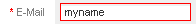
- Email: Accepts any email address. Input is limited to letters, numbers, '@' (at signs), '.' (periods), '_' (underscores), and (-) hyphens. Note that this validation option is only meant to cover the most common forms of email addresses since the RFC specification allow for the inclusion of many more symbol characters in the name portion of the email address.
If more customized types of data validation are needed, it is worth exploring the power of JavaScript.
After changing the value of a textbox with the validate option enabled, the textbox will be bordered in red if the value is invalid or bordered in green if valid.
XML definition:
CSS for Validate
The appearance of invalid and valid textboxes can be customized by changing the Cascading Style Sheet definition for input.FormFieldInvalid and input.FormFieldValid in the style.css file of the current skin:
{
border: 1px solid red;
}
form.formDefault input.FormFieldValid
{
border: 1px solid green;
}
JavaScript for Validate
The validate functions only work if a user is typing input into a field. If the user pastes text into a field, the input is not validated. To work around this problem, add an onchange event handler to the field that will strip out any unwanted characters. For example, the following JavaScript code can be used to strip out any input that is not a number:
var val = getField("myfield").value;
var newVal = "";
for (var i = 0; i < val.length; i++) {
if (var.charAt(i).match(/\d/))
newVar += var.charAt(i);
}
getField("myfield").value = newVal;
}
getField("myfield").onchange = stripNonNumeric;
To strip any input that isn't a floating point number, replace the corresponding line in the code above with this line:
To strip any input that isn't a letter of the alphabet, replace the corresponding line in the code above with this line:
To strip any input that isn't an alphanumeric character, replace the corresponding line in the code above with this line:
Mask
| Used by: textbox, currency, percentage, date. |
Masks assure that data entered into a field will conform to a customized pattern. Masks are very useful for standardizing data entry. The following characters have special meanings in masks:
| # (hash symbol) | Permits (but does not require) any number or '-'. |
| 0 (zero) | Requires a number. If a letter is typed instead of number, it is transformed to a zero. This character is useful for filling in zeros automatically and forcing a number to have a certain number of decimal points. |
| ; (semicolon) | Separates multiple masks. |
Any other characters in the mask are literals, which should be contained in the text. If a mask contains a literal, it will be automatically inserted into the text while data is being entered. This automatic insertion helps speed up data entry and ensures a standardized format for the data. Characters that don't conform to the mask are not inserted (or transformed to zeros in the case of a '0' mask).
Examples:
| Mask | Valid input |
|---|---|
| ###,### | 2 1,234 456,234 |
| ###,###,##0.00 | 0.00 45.05 67,170,235.00 |
| ###,###.00;###,### | 3 3.00 598,032.89 |
XML definition:
Converting Masked Numbers
All fields are saved as strings of characters when a Dynaform is submitted. If a mask is used to insert characters into a field, those characters will be saved in the field's value. This may cause problems when using masks in fields that contain numbers, because ProcessMaker may not be able to properly convert these values when used in a subsequent trigger. Remember that in PHP, numbers do not have commas and a period "." is used to separate decimal digits.
For example, if using the mask "###,###.##" in a textbox named "Amount", then a comma will automatically be inserted to separate the thousands digits. A value of "23456.79" will become "23,456.79", but if that value is used as a case variable in a trigger, the string of "23,456.79" will be converted into the integer 23, because PHP stops converting when it encounters the comma.
In the following trigger code:
An @#Amount of "23,456.79" will convert to 23, so @%Discount will be equal to -77. To properly convert, the commas have to be stripped out of the string before converting to a number. Use PHP's str_replace() function to replace the commas with an empty string and the type caster (int) to convert the string into an integer:
If working with floating point numbers (real numbers that can have decimal points), then use the type caster (float):
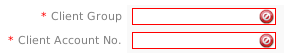
Required
| Used by: textbox, currency, percentage, password, suggest, textarea, dropdown, yesno, listbox, radiogroup, date, file. |
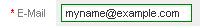
Activate this option to require that the field not be left blank.
A red asterisk * will be displayed to the left of the field's label to indicate that it is required.
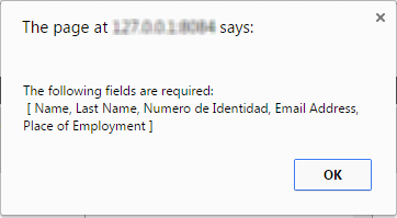
When the form is submitted, all required fields will be checked to ensure they are filled and green checkmarks will appear on the right-hand side of the filled-in fields.
If a required field is left blank, the field's border will change to red and a red Ø icon will appear on the right-hand side of the field to draw the users' attention.
In addition, the form won't close and a message box will appear to inform the user that the field needs to be filled in.
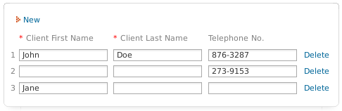
Grid fields can be required just like normal fields by marking the Required property when defining the grid form. A red asterisk will appear to the right of the grid field's label, but grid fields will not display green checkmarks or red Ø icons when validated.
JavaScript for Required Fields
The enableRequiredById() and removeRequiredById() functions can be used to enable or disable the required property of a field. For example, when the "email" option is selected in the "contactMethod" dropdown box, the clientEmail field becomes required, otherwise, it isn't required:
if (getField("contactMethod").value == "email")
enableRequiredById("clientEmail");
else
removeRequiredById("clientEmail");
}
//execute when dropdown box is changed:
getField("contactMethod").onchange = setEmailRequirement;
setEmailRequirement(); //execute when form loads
The validateForm() function can be used to check that all required fields are filled. If all the required fields have values, then the function returns true. Otherwise, it returns false and displays a message box informing the user that a required field still needs to be filled in.
For instance, the following JavaScript code can be added to a button named "SaveButton" to automatically save the data in the form if all required fields are filled in:
if (validateForm(document.getElementById("DynaformRequiredFields").value))
saveForm("");
}
To highlight the required fields that are blank in pink (but not show the user a message), then use the form's verifyRequiredFields() method. For example:
eval("form_" + this.form.id).verifyRequiredFields();
}
Making Checkboxes Required
Checkboxes do not have an option to make them required. However, it may be useful to force the user to mark a checkbox. For example, a Dynaform has a checkbox named "agreeLicense" that the user has to check to indicate that he/she agrees with the license. When the user submits the form, the code checks whether the user has checked the option:
if (getField("agreeLicense").checked != true) {
G.alert("Please mark the option 'I Agree with the License' before continuing!", "Agreement Required");
return false;
}
return true;
}
getField("agreeLicense").form.onsubmit = makeCheckboxRequired;
Customized Messages for Required Fields
To display a custom message to the user when a field is left blank, don't use the Required property. Instead, create an event handler for the Dynaform's submit event that checks if the field's value is blank and displays a custom message with alert() or G.alert(). If the event handler returns false, then the Dynaform's data can't be submitted and the user will be forced to fill in the blank field. If it returns true, then the submit will occur and the process will continue.
For example, a custom message is displayed if the field "driverID" is left blank when the Dynaform is submitted:
if (getField("driverID").value == "") {
G.alert("The Driver ID field can not be left blank!", "Error");
return false;
}
else {
return true;
}
}
Likewise, custom validation can be created for grids. In this example, a custom message is displayed if a grid field named "clientName" is left blank in a grid named "clientList":
var totalRows = Number_Rows_Grid("clientList", "clientName");
for (var i = 1; i <= totalRows; i++) {
if (getGridValueById("clientList", i, "clientName") == "") {
G.alert("Please enter a Client Name in row " + i + ".", "Error");
return false;
}
}
return true;
}
Read Only
| Used by: textbox, currency, percentage, password, textarea, dropdown, yesno, date. |
Activate this option to only allow the user to read, but not change, a field's value. Read only will not affect the visual appearance of the field. To give a visual clue to the user that the field's value can not be changed, use the setting mode="view" which eliminates the outline of the field's input box and only displays its value.
XML definition:
Note: Before version 1.2-2985, Read only did not work for dropdown boxes and yes/no boxes. See below for a workaround with JavaScript.
Set Read Only with JavaScript
All types of textboxes can be set to read only by setting their readOnly property to true:
To turn off read only:
Likewise, the readOnly property can be set for options in radiogroups. For instance, a radiogroup named "howContact" with the values of the options set to "radio", "telephone" and "fax" can be set to read only:
getField("howContact][telephone").readOnly = true;
getField("howContact][fax").readOnly = true;
However, setting the readOnly property in JavaScript does not affect dropdown boxes, listboxes, yes/no boxes, checkboxes and checkgroups. To make these types of fields read-only, add code to reset the field back to its original value when it is changed. For instance, this code prevents the field named "MyField" from being changed:
function makeReadOnly() {
getField("MyField").value = origValue;
}
getField("MyField").onchange = makeReadOnly;
To make a checkbox read-only:
function makeReadOnly() {
getField("MyCheckbox").checked = origValue;
}
getField("MyCheckbox").onchange = makeReadOnly;
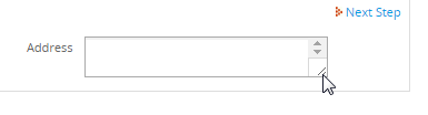
Resizable
 Available In Version: 2.8 and later.
| Used by: Textareas. |
This property allows textareas to be resized. Note that this property does not work if using Internet Explorer v. 9.0 and later
XML Definition:
For example, create a Dynaform with the following textarea field:
<en>text</en>
</Address>
The resizable attribute is set to 0, which means that the textarea will not be resizable, as shown in the image below:
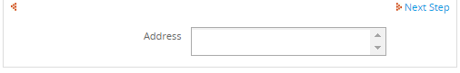
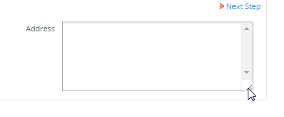
However, if changing the resizable attribute to 1:
<en>text</en>
</Address>
In the bottom right corner of the textarea, two lines will appear that indicate that the element can be resized:
Move the mouse to the right side to resize the textarea:
Formulas
| Used by: textbox, currency, percentage. |
Textboxes, currency boxes and percentages boxes that are in grids can have their values calculated using custom formulas. Formulas can include numbers and standard mathematical operators for addition +, subtraction -, multiplication *, division /, and modulus % (remainder from division), as well as parentheses () to group operators. The values stored in textboxes, currency boxes, percentage boxes and dropdown boxes can also be referenced in the formulas through their field names, as long as their values are numerical. If the contents of a referenced field are non-numerical characters, the field with the formula will display "NaN", which stands for "Not a Number". Only fields that are in the same row in the grid can be referenced in formulas.
Formulas can not include incrementors ++, decrementors --, literal strings, function calls, such as Math.pow(), nor mathematical constants such as Math.PI. Fields that contain unrecognized elements will be displayed as blank. The formulas round their results to two decimal digits. Results are rounded to two decimals and will be displayed ignoring the settings in the mask, validate, read-only and mode properties. The user, however, can enter input into the field, overwriting the results. Set the fields to read-only to prevent the user from changing the results of formulas.
To add a formula to a textbox, currency or percentage box, edit the XML definition of the field to add the formula.
Examples:
formula="3.14 * radius * radius"
formula="Price * (Quantity + 2)"
formula="(total+400.35)/2 - discount*0.15"
XML Definition:
Longer Example:
Create a Dynaform with the following two fields:
<en>Total Expense</en>
</Cash>
<en>Total Bussines Expenses</en>
</TotalPayables>
Then create a third field adding a formula as an attribute in its XML code:
<en>Total Cash $</en>
</Result>
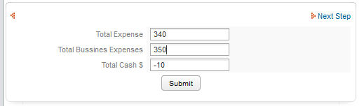
It's important to add the formula to the field where the result will be displayed.
This example avoids the use of JavaScript code to validate fields for negative numbers. The results will be automatically saved to the Result variable as numbers are introduced to the text field. If it is required to validate each field, then the use of JavaScript is recommended.
Hint
| Used by: textbox, currency, percentage, suggest, textarea, dropdown, yesno, listbox, checkbox, checkgroup, radiogroup, date. |
This property displays a helpful hint to help users fill in the field. A hint can be used to provide a fuller explanation of the field or to indicate what the acceptable values for the field are. When a field has this property enabled, a  icon appears to the right of the field. The hint message pops up only when a mouse pointer hovers over the icon.
Note that international characters can be included in the hint message, as well as HTML markup. For example, use <br> to insert a line break and <font color="red">...</font> to change the text to red.
XML definition:
Changing Hints with JavaScript
Hints are displayed by the showTooltip() function. To change the text in a hint, define a new event handler for the onmouseover event that calls the showTooltip() function with different text:
showTooltip(event,"some_text");
return false;
}
getField("field_name").parentNode.getElementsByTagName("a").item(0).onmouseover=changeHint;
Where field_name is the name of the field with a hint and "some text" is the new text to display.
Setting Hints with PHP
To set a hint's message with PHP, first create a hidden field in the Dynaform to hold the new text for the hint. Then, fire a trigger beforehand that sets the value of the hidden field. Finally, add JavaScript to the Dynaform that will set the text of the hint to the value of the hidden field.
For example, to set a hint to a textarea named "accountNotes", create a hidden field named "accountNotesHint". Then, create the following trigger to set the value of the @@accountNotesHint variable based upon the type of account:
@@accountNotesHint = "Enter the kinds of office supplies.<br>Examples: paper, toner, etc.";
elseif (@@accountType == 'emergency_funds')
@@accountNotesHint = "Enter the type of emergency funds.<br>" .
"Examples: natural disaster, rainy-day fund, etc.";
else
@@accountNotesHint = "Enter the type of funds.";
Set the above trigger to fire before the Dynaform. Then, add the following JavaScript code to the Dynaform to set the hint's text:
showTooltip(event, getValueById("accountNotesHint"));
return false;
}
Dependent Fields
| Used by: textbox, date, dropdown. |
This property allows other field(s) to be selected to be dependent field(s), and converts the present field into an independent field.
Normally the SQL SELECT queries used to populate Dynaform fields are only executed once when the Dynaform is initially displayed. Selecting a field to be a dependent field causes that field to execute its SQL SELECT query whenever the value in the independent field changes. The SQL SELECT statement in the dependent field can reference the value in the independent field as a case variable used in the query. Reference the independent field as a string variable @@INDEPENDENT-FIELD whose value will be enclosed in double quotes with backslashes added before quotation marks to escape them so they will be safely sent as part of a SQL string:
or as an unchanged variable @#INDEPENDENT-FIELD>:
If the INDEPENDENT-FIELD might contain values that aren't numbers, enclose '@#INDEPENDENT-FIELD' in single quotes so its value will be treated as a string and won't be considered a field name.
In Dynaforms, only textboxes, dropdown boxes and date boxes may be independent fields, while textboxes, dropdown boxes and listboxes may be dependent fields. If a textbox is the dependent field, the SQL SELECT query will determine the value inserted into the field. If a dropdown or listbox is the dependent field, the SQL SELECT query will populate the list of available options.
Dynaforms can use independent and dependent fields to easily conduct searches in an external database. For instance, an organization needs to search a database table called CLIENTS for a particular client. To search this database table, a Dynaform with an independent field, a textbox named "ClientNameSearch", can be designed. The Dynaform can also include a listbox named "ClientSearchResults" as the dependent field, which uses the following SQL SELECT statement to populate its list:
WHERE CLIENT_FIRSTNAME=@@ClientNameSearch OR CLIENT_LASTNAME=@@ClientNameSearch
Whenever a new name is entered into the "ClientNameSearch" textbox, all the clients with matching names will be displayed in the "ClientSearchResults" listbox.
Because the value of the independent field can change while the Dynaform is being used, the SQL SELECT statement in the dependent field also needs to be allowed to change so it can conduct queries with the new value. Normally the SELECT statement is fixed in the XML definition of the field, but the SQL SELECT statements for dependent fields are placed in a character data structure <![CDATA[...]]> so they won't be parsed as XML. That way the SELECT statement can be altered and the database requeried while the Dynaform is in use. For instance, here is the XML definition of the "ClientSearchResults" listbox:
defaultvalue="" sqlconnection="5821228024ab657ac40d9b3065753771" readonly="0">
<![CDATA[SELECT CLIENT_ID, CONCAT(CLIENT_FIRSTNAME, ' ', CLIENT_LASTNAME) FROM CLIENTS
WHERE CLIENT_FIRSTNAME=@@ClientNameSearch OR CLIENT_LASTNAME=@@ClientNameSearch]]>
<en>SEARCH Results: <OPTION name=""/></en>
</ClientSearchResults>
Note that a blank option appears at the top of the list above the search results. That way no client will be selected by default. To remove the blank option, remove <OPTION name=""/> from the XML definition.
The independent field does not have to be limited to the WHERE clause of the SELECT statement. It can be used in any part of the statement. For instance, if a Dynaform has a dropdown box named "ClientColumn" where the user can select one of the fields in the CLIENTS table, then the dependent field can have the following SQL SELECT statements:
or:
For more examples of how to use dependent fields in Dynaforms, see Dependent Fields.
XML Definition in the independent field:
Note: If there are more than one dependent field, separate them with commas, but do NOT include any spaces.
XML Definition in the dependent field:
Default Value
| Used by: textbox, currency, percentage, suggest, textarea, dropdown, yesno, date, hidden. |
The default value of the field, which will appear in the field when the Dynaform is first displayed. This value can be changed by the end user (unless the field is set to Read Only or View Mode.
XML Definition:
Size
| Used by: textbox, currency, percentage, password, suggest, listbox, date. |
The width of the text box, measured in terms of the average number of characters that can be displayed at a time. For variable-width fonts, the actual number of characters varies widely. For instance, in Arial, which is the default font for input fields, ten 'w's can fit in the default width of 15, while 49 'i's can fit in the same space.
For listboxes, the size property does not refer to the horizontal width, but rather the number of rows of options that will be displayed at a time. If there are more options than can be automatically displayed, a vertical scrollbar will automatically appear so the user can scroll to select additional options.
For all other fields, such as buttons, dropdown boxes, listboxes, checkgroups, etc., the width of the field adjusts automatically depending upon its content.
XML definition:
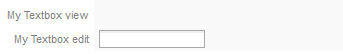
Mode
| Used by: textbox, currency, percentage, password, suggest, textarea, dropdown, yesno, listbox, checkgroup, radiogroup, date,hidden. |
Mode determines whether the user can edit the input in a field or only view it.
Unlike read-only, the mode also affects the appearance of the field, so the user can see whether a field is editable or only readable. Text fields in view mode display their value, but do not display an outline of the field. Likewise, dropdown boxes and yes/no boxes display their values, but do not allow the user to see the outline of the dropdown box or any of the other available options. (See Read only for code that allows the user to see the options, but not change the selection.) Listboxes, checkgroups and radiogroups display all their available options, but their borders are slightly grayed out to indicate that they are in view mode. Buttons in view mode are grayed out and are unable to be clicked. View mode is similar in appearance to when a field has its disabled property set to true with JavaScript, but a disabled field won't create a case variable when the form is submitted, whereas a field in view mode will create a case variable.
XML definition:
Note: The Mode property for individual fields only takes effect if the Determined by Fields option is selected for the Mode under the Properties tab for the entire Dynaform. The default option is Edit All, so by default all fields are automatically in edit mode.
To set an individual field to view mode in the XML code, edit the header of the Dynaform and set mode="", then go to the XML definition of the individual field and set mode="view". For example:
<dynaForm type="xmlform" name="1467799194acd264d36d3a1031041565/5931277774acd26cbcce7c6006600537"
width="500" enabletemplate="0" mode="" nextstepsave="">
<mytextview type="text" maxlength="64" validate="Any" required="0" readonly="0" size="15"
mode="view" mask="" strto="" dependentfields="" defaultvalue="" sqlconnection="">
<en>My Textbox view</en>
</mytextview>
<mytextedit type="text" maxlength="64" validate="Any" required="0" readonly="0" size="15"
mode="edit" mask="" strto="" dependentfields="" defaultvalue="" sqlconnection="">
<en>My Textbox edit</en>
</mytextedit>
</xml>
Setting Grids to View Mode
Grid objects have no mode property. To set a grid to view mode, the best solution is to disable the grid fields when the Dynaform is first displayed, then enable the grid fields when the Dynaform is submitted. For this to work, the grid can not have New and Delete controls.
for (var i = 1; i <= totalRows; i++) {
getGridField("MyGrid", i, "MyField1").disabled = true;
getGridField("MyGrid", i, "MyField2").disabled = true;
}
function enableGrid() {
for (var i = 1; i <= totalRows; i++)
{
getGridField("MyGrid", i, "MyField1").disabled = false;
getGridField("MyGrid", i, "MyField2").disabled = false;
}
return true;
}
getField("MySubmitButton").onclick = enableGrid;
SQL Connection
| Used by: textbox, currency, percentage, suggest, textarea, dropdown, listbox, checkgroup, radiogroup, hidden. |
Select an available database connection where the SQL statement will execute its query. If this field is left blank, the SQL statement will query the current wf_<WORKSPACE> database, which is generally the default wf_workflow database. To query the rb_<WORKSPACE> or rp_<WORKSPACE> databases, or a database that is not in the current workspace, create a database connection to those databases, just like a normal external database connection.
If establishing a connection to a PM Table, see Accessing PM Tables in Dynaforms with XML. Since PM Tables are stored in the wf_<WORKSPACE> database, it is also possible to query them by leaving the Sql Connection property blank.
XML definition:
Note: The SQL Connection property for suggest boxes includes a dropdown box with a list of databases that the user can connect to, including the built-in databases for ProcessMaker's current workspace: rbac, report and workflow.
SQL
An SQL SELECT statement to populate a field. The query will be executed in the database selected in Sql Connection. If a database connection is not specified, the query will be executed by default in the wf_<WORKSPACE> database of the current workspace. Do NOT include the database name in the SQL SELECT statement.
If the field is a dropdown, listbox, checkgroup or radiogroup, the SQL query will populate the list of options. The SQL SELECT statement should return two fields. The first is the value field, which is the value that will be stored when the user selects an option. The second field is the label field, which is what will be displayed when the user selects an option. All additional fields returned by the SQL query will be ignored. To display multiple fields in the label, use concatenation to join the fields into a single string.
The concatenation operator varies according to the type of database:
| DataBase | Operator | Example |
|---|---|---|
| MySQL | CONCAT() | SELECT ID, CONCAT(FIRSTNAME, ' ', LASTNAME) FROM CLIENTS |
| PosgreSQL | || |
SELECT ID, FIRSTNAME || ' ' || LASTNAME FROM CLIENTS |
| SQL Server | + |
SELECT ID, FIRSTNAME + ' ' + LASTNAME FROM CLIENTS |
| Oracle | CONCAT() or || |
SELECT ID, CONCAT(FIRSTNAME, ' ', LASTNAME) FROM CLIENTS |
If there are already existing options for the field, the results of the SQL query will be added to the end of the existing list of options. The options will be displayed in the order in which they are returned by the SQL SELECT query, so add ORDER BY and/or GROUP BY clauses to the query to specify the order.
Examples:
The first option in dropdown boxes will be the automatically selected value defined in the XML definition (unless a value is specified in the Default property). It will generally be a blank option, since it is included by default in the XML definition.
For example:
btn_cancel="Cancel" dependentfields="" defaultvalue="" hint="" sqlconnection="9372015834dacd361c5d2f4090709644">
<![CDATA[SELECT ID, CONCAT(FIRSTNAME, " ", LASTNAME) FROM CLIENTS]]>
<en>Select Client <option name=""></option></en>
</selClient>
To only draw options from the database query, manually edit the XML to remove all <option> tags from the definition:
btn_cancel="Cancel" dependentfields="" defaultvalue="" hint="" sqlconnection="9372015834dacd361c5d2f4090709644">
<![CDATA[SELECT ID, CONCAT(FIRSTNAME, " ", LASTNAME) FROM CLIENTS]]>
<en>Select Client</en>
</selClient>
To force a user to manually select an option, rather than just automatically accepting the first option in the list, make the field required and set the first option to a blank name with a label telling the user to --Select-- something:
btn_cancel="Cancel" dependentfields="" defaultvalue="" hint="" sqlconnection="9372015834dacd361c5d2f4090709644">
<![CDATA[SELECT ID, CONCAT(FIRSTNAME, " ", LASTNAME) FROM CLIENTS]]>
<en>Select Client <option name="">--Select--</option></en>
</selClient>
If the user tries to submit the form, a message box will appear informing the user to select an option.
If the field is a textbox, currency, percentage, textarea or hidden field, the SQL query sets the initial value of the field when the Dynaform is first displayed. The user is free to change that value (if the field is not set to read-only or view mode). The value inserted into the Dynaform field will be the first field (column) in the first record returned by the SQL query. All other columns and records will be ignored. To obtain more than one field, use the CONCAT() function to concatenate the fields into a single string.
Any changes made to the value in a Dynaform field will not be written back to the original database (since SELECT statements are read-only). If you want the changes entered into a Dynaform field to be written back to the original database, you will have to write custom code in a trigger that fires after the Dynaform. Use executeQuery() to send an SQL UPDATE or INSERT statement to the original database.
When writing SQL SELECT statements, enclose literal values in single quotation marks, otherwise it is assumed that they are numbers or field names. To include a single quote inside a string, precede it with a backslash. For example: 'You can\'t say \'hello\'?'
SQL keywords, such as SELECT, FROM and WHERE, are case insensitive, so they can be written in upper or lowercase. In Windows, MySQL field and table names are also generally case insensitive, but in Linux/UNIX they are case sensitive, so it is best to use the exact spelling if planning on migrating processes between Windows and Linux/UNIX servers. To specify a date, time or datetime literal, use one of the following formats:
- DATE 'yyyy-mm-dd'
- TIME 'hh:mm:ss[.fff]'
- TIMESTAMP 'yyyy-mm-dd hh:mm:ss[.fff]'
To learn the format of SQL SELECT statements, see this basic tutorial or this more advanced one. To query ProcessMaker's internal databases, see these examples.
XML definition:
Option
| Used by: dropdown, listbox, checkgroup, radiogroup. |
An option is a choice that can be selected for a dropdown box, listbox, checkgroup or radiogroup.
Each option consists of a value and label pair. The value is what is stored when a user selects an option, whereas the label is the text that the user sees. When defining options in the ProcessMaker graphical field editor, values can only be entered that contain letters, numbers and underscores. It is possible to define values in the XML code with other characters but it is not recommended. Options can also be populated with an SQL SELECT statement that queries a database or an array. Any options returned by an SQL SELECT statement are appended to the existing list of options defined in the XML. Remember to always select two columns with the SELECT statement. The first for the value field and the second for the label field.
For dropdown boxes and listboxes, the first option in the list is automatically selected when the Dynaform is first displayed (unless a Default value is defined). If the user should be forced to select an option, rather than automatically selecting the first option in the list, put an option with an empty value and a label, such as "--Select--", as the first option in the list (<option name="">--select--</option>) and make the field a required field. If the user doesn't select an option, an error message will tell the user to fill in the field.
XML definition:
Note: If there are too many options defined in the XML, an error message like the following will appear when the form is displayed:
/opt/processmaker/shared/sites/workflow/xmlForms/3460693204f60db7eb05d98067024418/8119788164f60dbf3ac4341086263705_tmp0.xml:
Undeclared entity error at line 98 in /opt/processmaker/gulliver/system/class.xmlDocument.php on line 277
If more options are needed, create a PM Table or an external database table to contain the values and labels of the options and use an SQL query to populate the options.
Multilingual Options
To create a multilingual process, the labels of the options can be defined for different languages by enclosing the options in language tags, such as <en>...</en> (english), <es>...</es> (Spanish) and <pt-BR>...</pt-BR> (Brazilian Portuguese). If the user is using a system language for which the field doesn't have language tags, then the labels will display the first language defined in the XML definition.
To add an additional language, log in to ProcessMaker in that language and edit the Dynaform field in the Fields Handler tab. Translate the labels for the options into the desired language. When the field's properties are saved, a new set of options will be saved for the field inside language tags. To create conditions or triggers that reference the selected option in a field, it is recommended to leave the value of each option the same and to only translate the label. That way the selected values of the options won't change with each different language.
The other way to add additional languages is to manually edit the XML code and add translations for the options inside language tags. Remember to enclose non-ASCII characters (such as "ë", "¿" and "Í") inside an XML character data structure:
For example, to define the options for the "contactMethod" dropdown box in English, Spanish and Quechua:
<en>How Contact? <option name="telephone">Telephone</option>
<option name="fax">Fax</option>
<option name="email">Email</option>
<option name="normal_mail">Normal mail</option>
<option name="group_meeting">Group meeting</option>
</en>
<es><![CDATA[¿Cómo contactar?]]><option name="telephone">Telefono</option>
<option name="fax">Fax</option>
<option name="email">E-correo</option>
<option name="regular_mail">Correo normal</option>
<option name="home_visit"><![CDATA[Reunión en grupo]]></option>
</es>
<qu>Imayna waqllan <option name="telephone">Telefono nisqa</option>
<option name="fax">Fax nisqa</option>
<option name="email">E-Chaski</option>
<option name="regular_mail">Chaski</option>
<option name="home_visit"><![CDATA[Juñupi parlanakuy]]></option>
</qu>
</contactMethod>
In this example, users entering Spanish will see "¿Cómo contactar", while users entering in Quechua will see "Imayna waqllan?". Users entering a language that isn't defined for the dropdown box, such as French, will see the default label in English: "How Contact?"
Notice that the phrases "¿Cómo contactar?", "Reunión en grupo" and "Juñupi parlanakuy" are enclosed in character data structures because they contain non-ASCII characters.
Note: The multilingual option only works with Dynaform fields but not with task names, which means that changing the language of a workspace won't affect the task names.

